UI / UX Philosophies
My core design principles and philosophies that guide every project I work on.
Navigation Systems
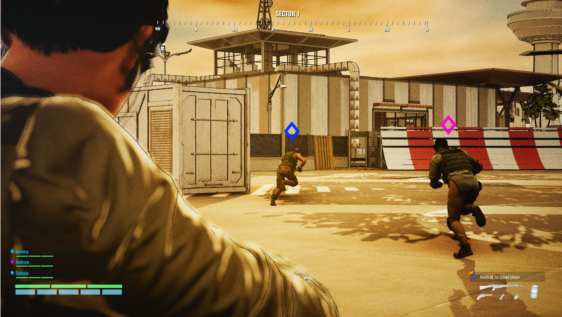
Across the last two FPS titles I've worked on—as well as the YVR digital twin project—I've focused heavily on designing and refining navigational systems. This includes core elements such as compasses, waypoints, mini-maps, and map icons, all of which work together to guide players through the experience.
In both Starship Troopers and Firestorm, I designed and managed multiple layers of map interaction and player messaging, following patterns common across modern games. This included waypoints for navigation and mission objectives in both discovered and undiscovered states.
The system also handled players and enemies as dynamic elements. Enemies could shift between discovered and undiscovered states, with visibility that decayed over time. I also defined how player pings appear and persist across the compass and map, ensuring clarity without overwhelming the player.
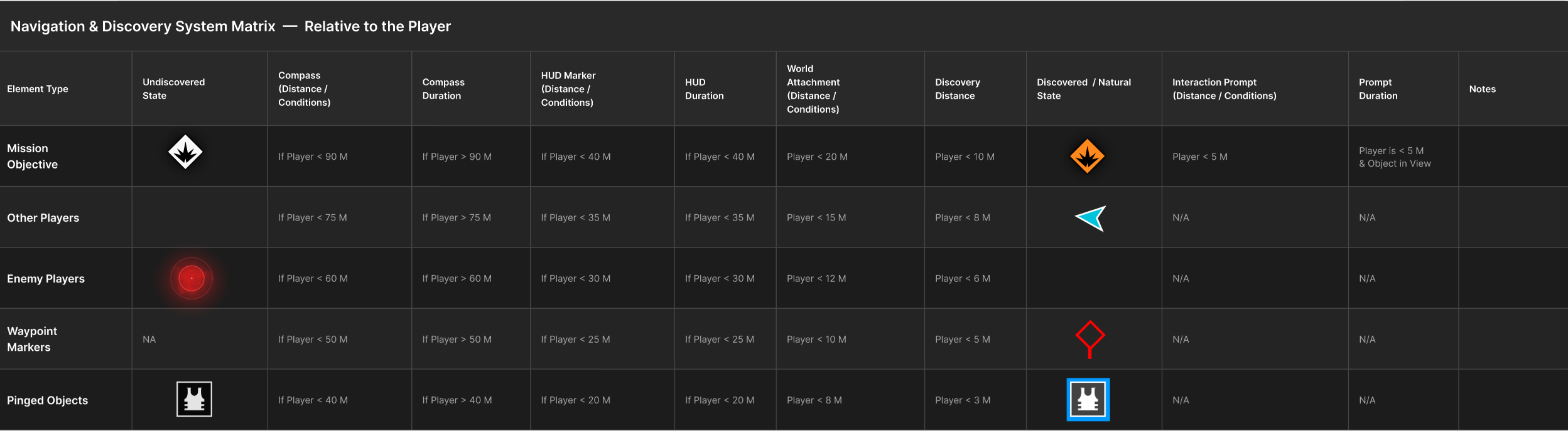
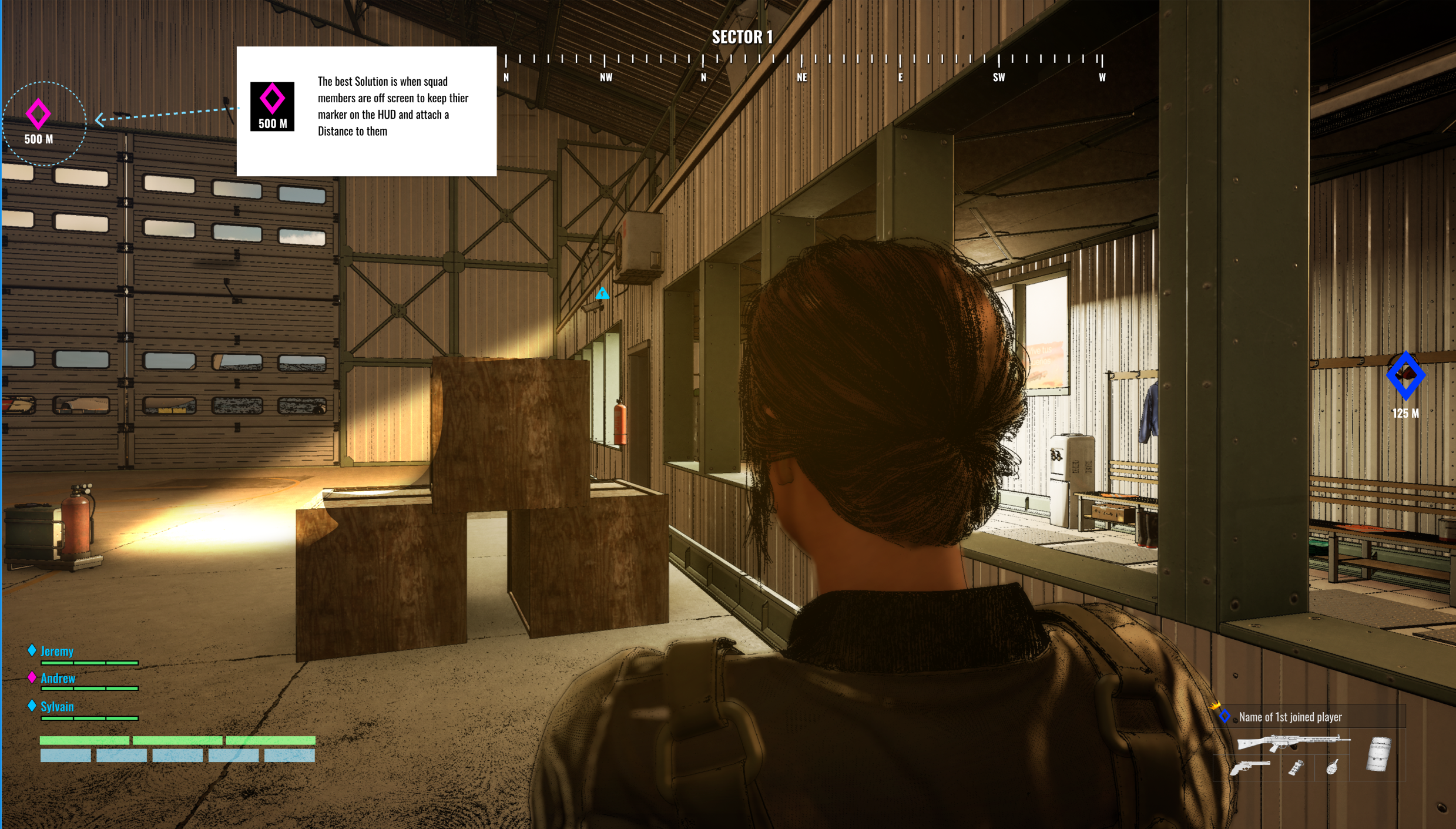
Identifying Map Assets and the Distances They Become Meaningful to the Player
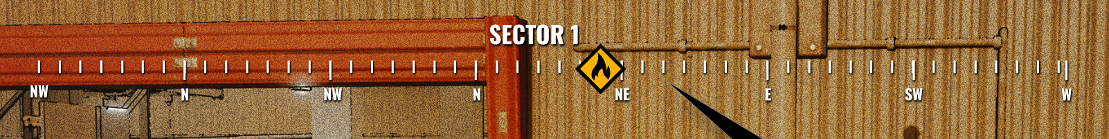
Not every map element has the same importance at the same distance. A mission objective can stay visible on the compass from far away, while an enemy ping at that range becomes noise. Designing navigation means defining when each element becomes visible and how it escalates in detail.
Layered Visibility
Elements appear in stages: compass → HUD → world label → interaction prompt.
Distance + Intent Rules
The closer the player gets, the more precise and actionable the information becomes.
Clear Thresholds
Each element type needs defined cutoffs for when it appears and what form it takes.
Balance
Too early = clutter. Too late = confusion.
Purpose of Matrix
A shared reference that locks visibility rules per element type into a testable system.
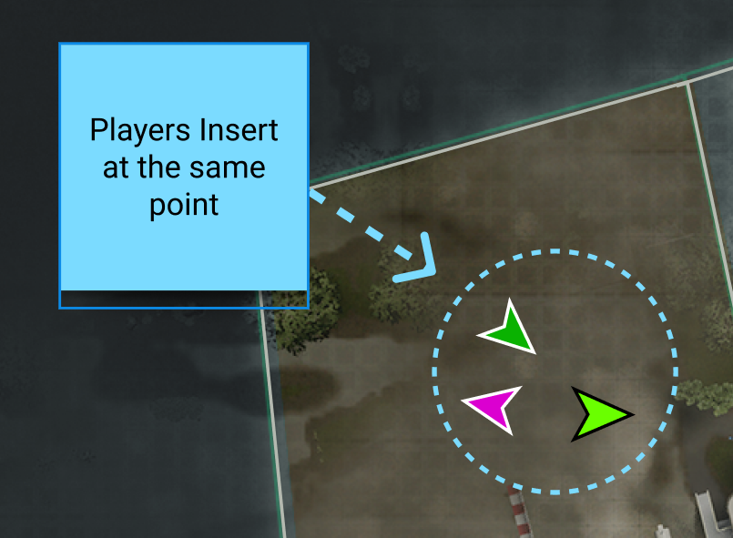
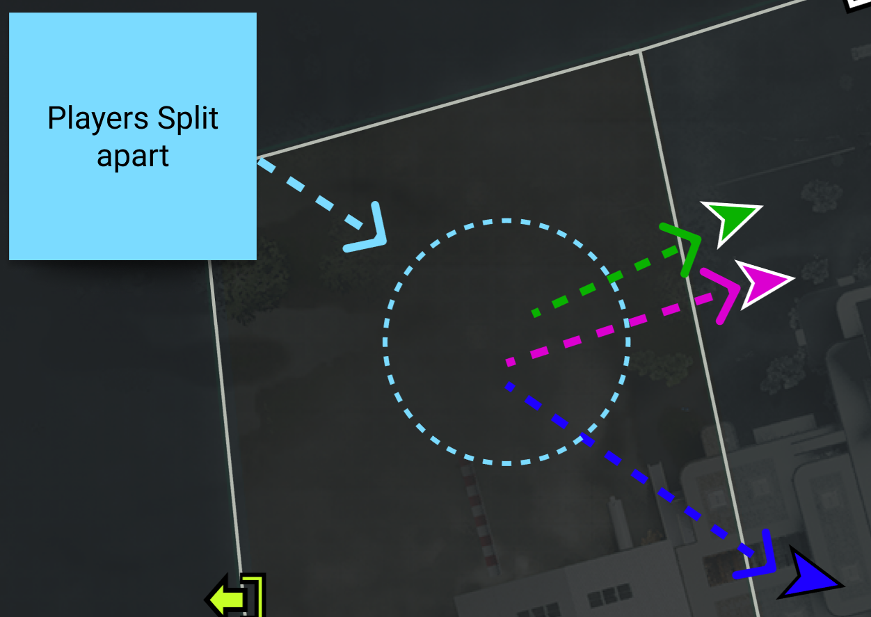
Squad Alignment
A major challenge in both FPS projects was keeping players coordinated when squads split up or went solo. The core problem is controlling what information teammates receive, and when, so the team stays aligned without overwhelming the HUD.
This comes down to how shared objectives and player actions are broadcast across the system:
Team Cohesion vs. Solo Movement
Supporting split behavior while still keeping players aware of squad intent and direction.
Shared Mission Propagation
When a player adopts a mission, the system must decide how and when that information is exposed to other teammates.
Layered Visibility Across Teammates
Mission locations and objectives need defined rules for how they appear across compass, HUD, and waypoint systems, including distance thresholds.
Cross-Player Awareness Rules
Determining what teammates see about each other's actions, pings, and objectives based on proximity and relevance.
Consistent Map Messaging System
Coordinating compass markers, HUD messages, waypoints, and pings so information is synchronized and readable across the whole squad.
Design Goal
Maintain team awareness and direction without turning the UI into constant noise.
The Ping & Waypoint Problem
Pinged objects and waypoint markers present a uniquely interesting design challenge — not just as navigation tools, but as communication between players. Unlike static objectives, pings and waypoints carry intent: one player is trying to direct the attention of another.
That intent breaks down when distance enters the equation. If two teammates are on opposite ends of the map, a ping near one player is essentially noise to the other — it sits at the edge of their compass, or clutters their HUD, without providing any actionable context. The marker exists, but it means nothing.
This creates a threshold problem: at what distance does a teammate's ping or waypoint earn its place on screen? And once you've decided it should appear, where does it belong — on the compass, as a HUD marker, attached to the world, or some combination that scales with proximity?
These decisions shape whether players feel informed or overwhelmed. The goal is a system that surfaces communication only when it's meaningful — fading or suppressing elements that would otherwise add confusion rather than clarity.
Visual Hierarchy & Clarity
An important challenge is managing the importance of different navigational elements. By carefully controlling visual hierarchy—what stands out, when it appears, and how it behaves—I shape how players interpret and prioritize information within the game space.
Experience Shaping Through Movement
Ultimately, these systems are not just functional—they directly influence how players experience and traverse the world. By tuning the appearance, timing, and behavior of navigational cues, I guide player movement, maintain engagement, and create a smoother, more intentional journey through the environment.