Firestorm
New World Interactive
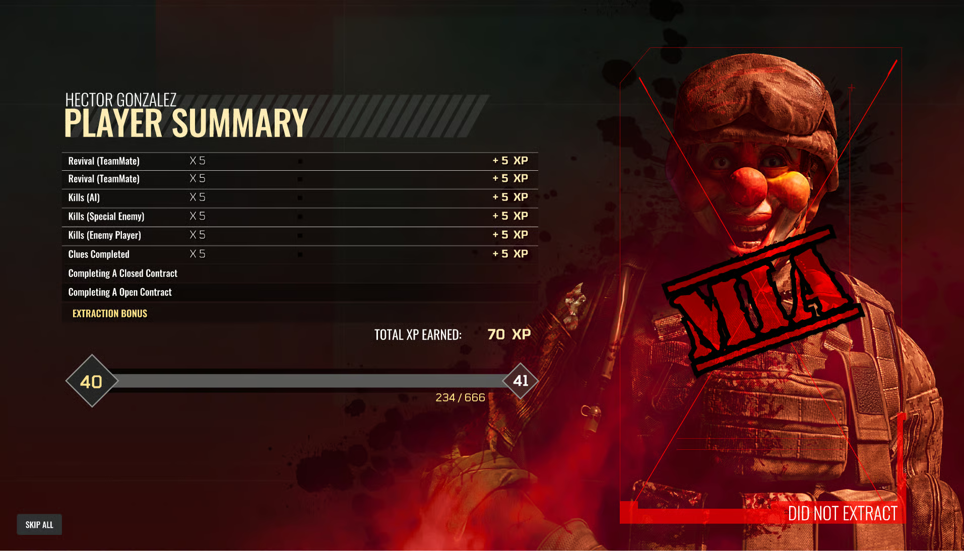
Character Selection & Heroes
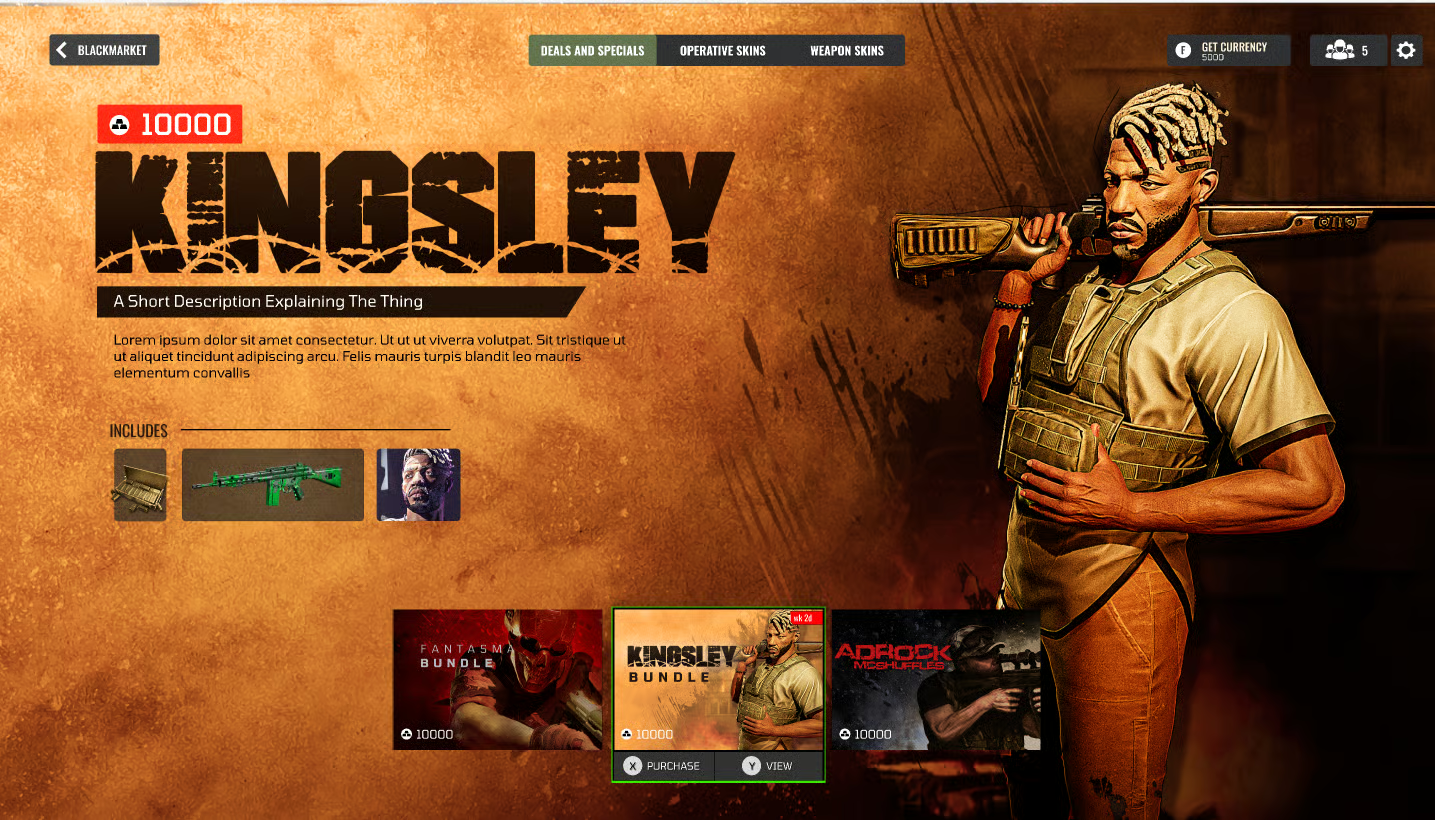
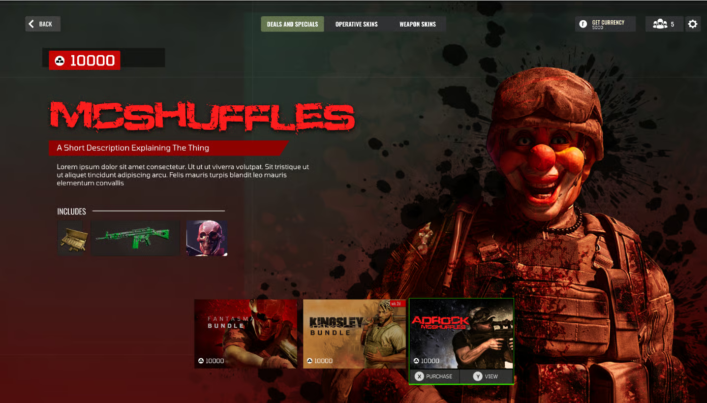
Operator screens showcasing loadouts and personality. Each hero brings distinct abilities and weapons for diverse tactical gameplay.
Operator roster overview with loadout selection and ability preview.
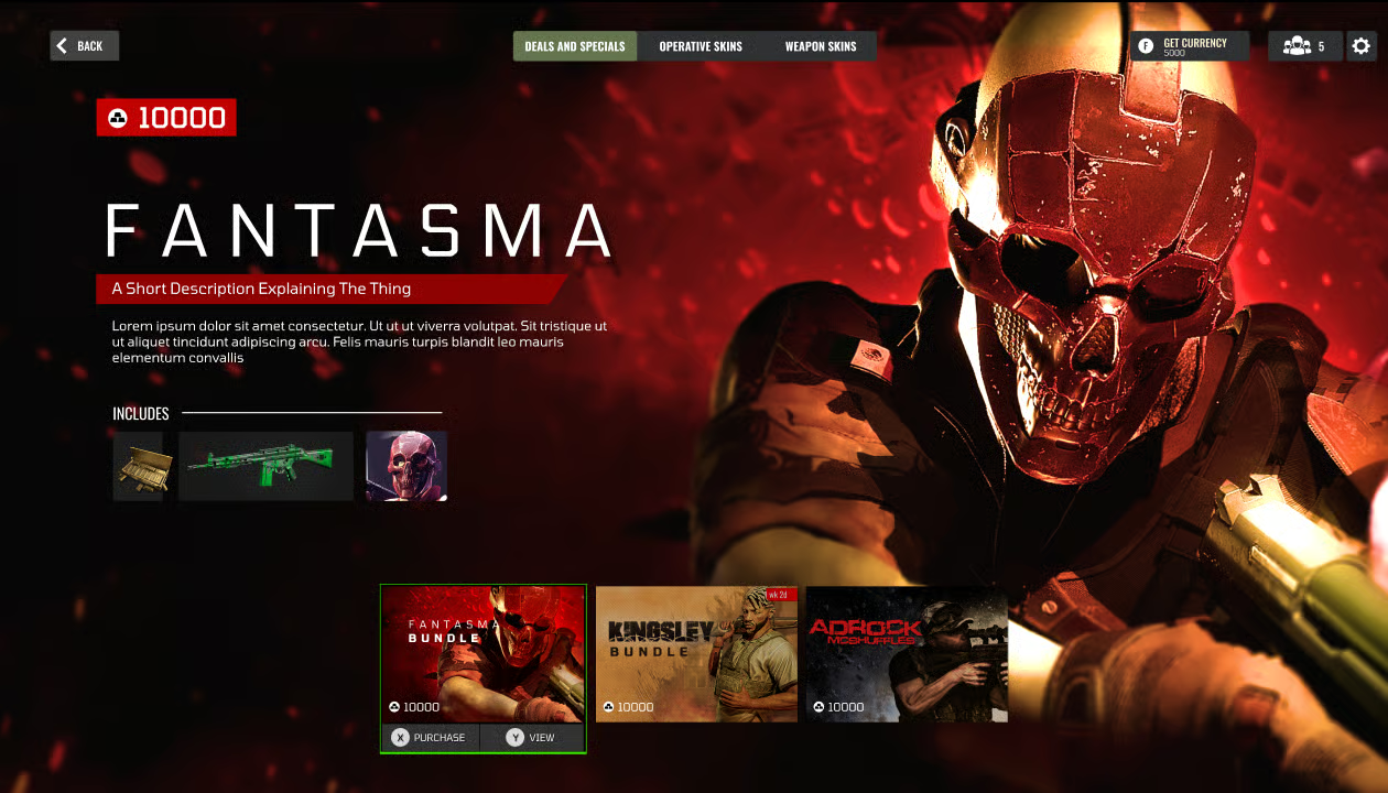
Detailed hero profile with weapons and tactical role breakdown.
Team composition screen showing squad synergies and abilities.
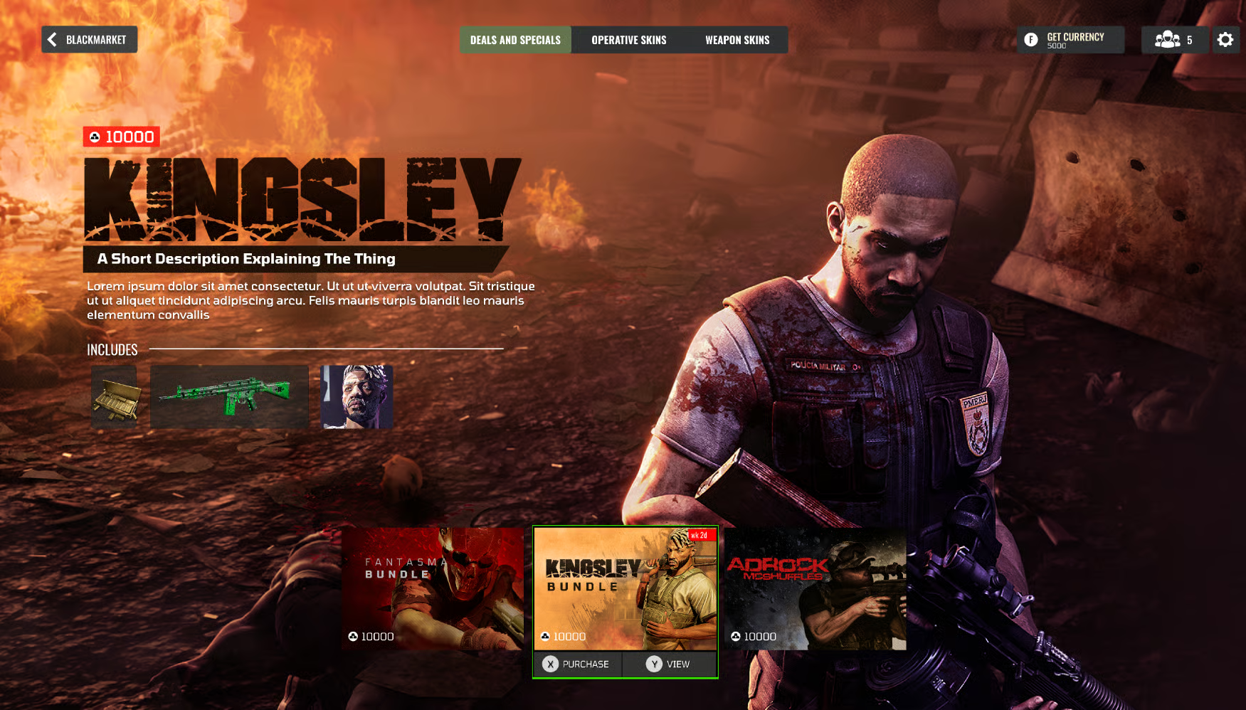
Operator customization with equipment and perk selection.
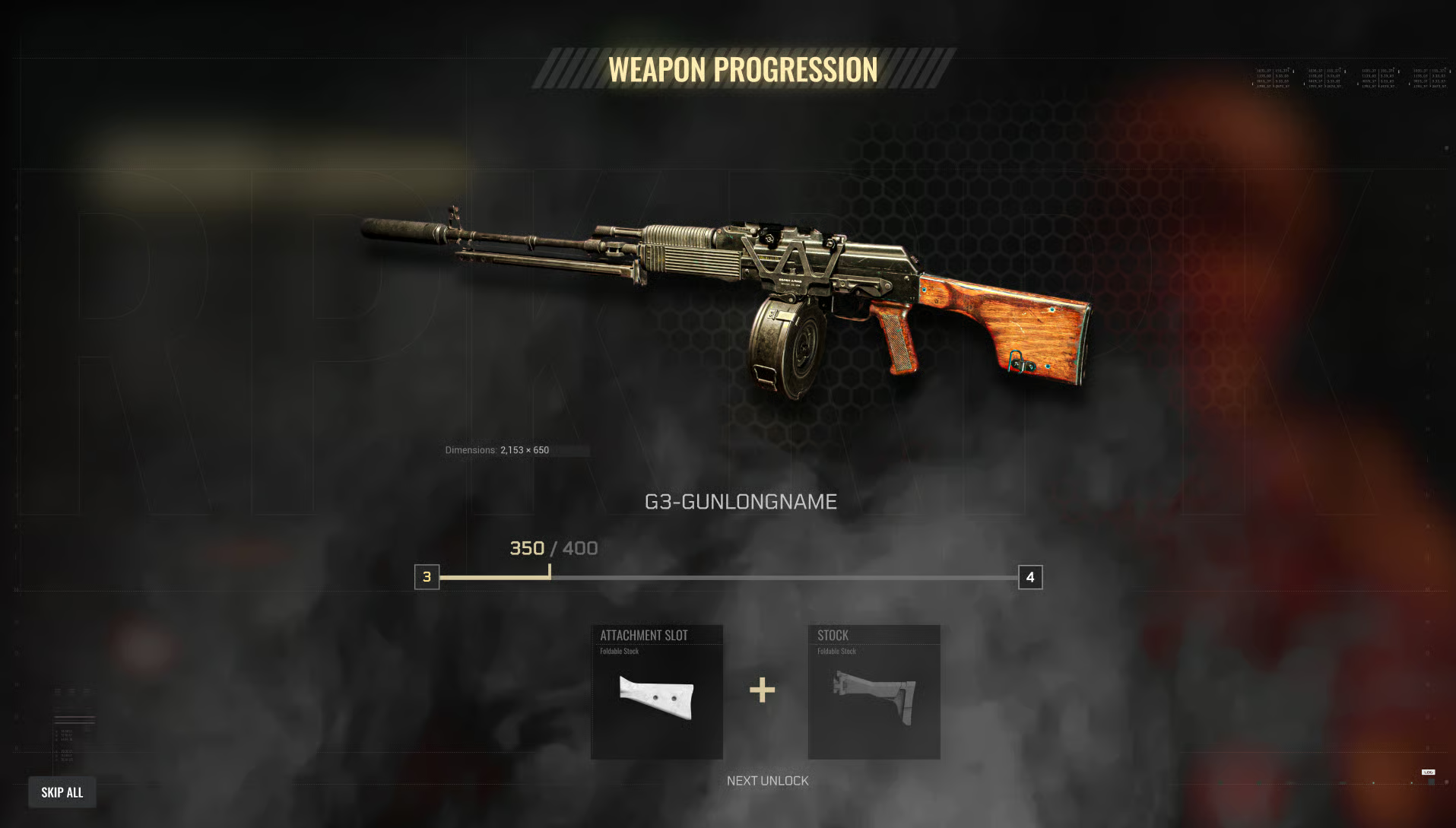
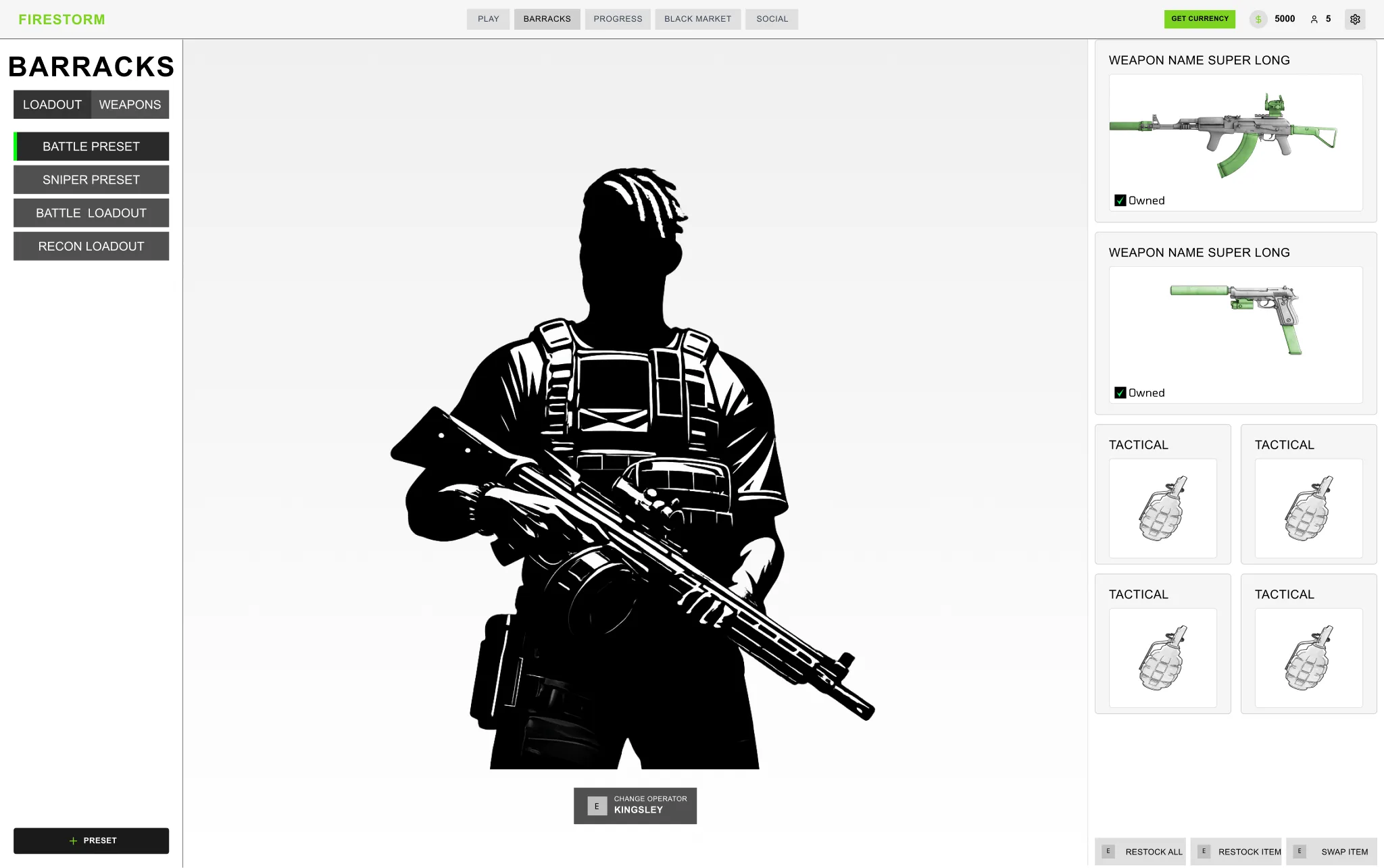
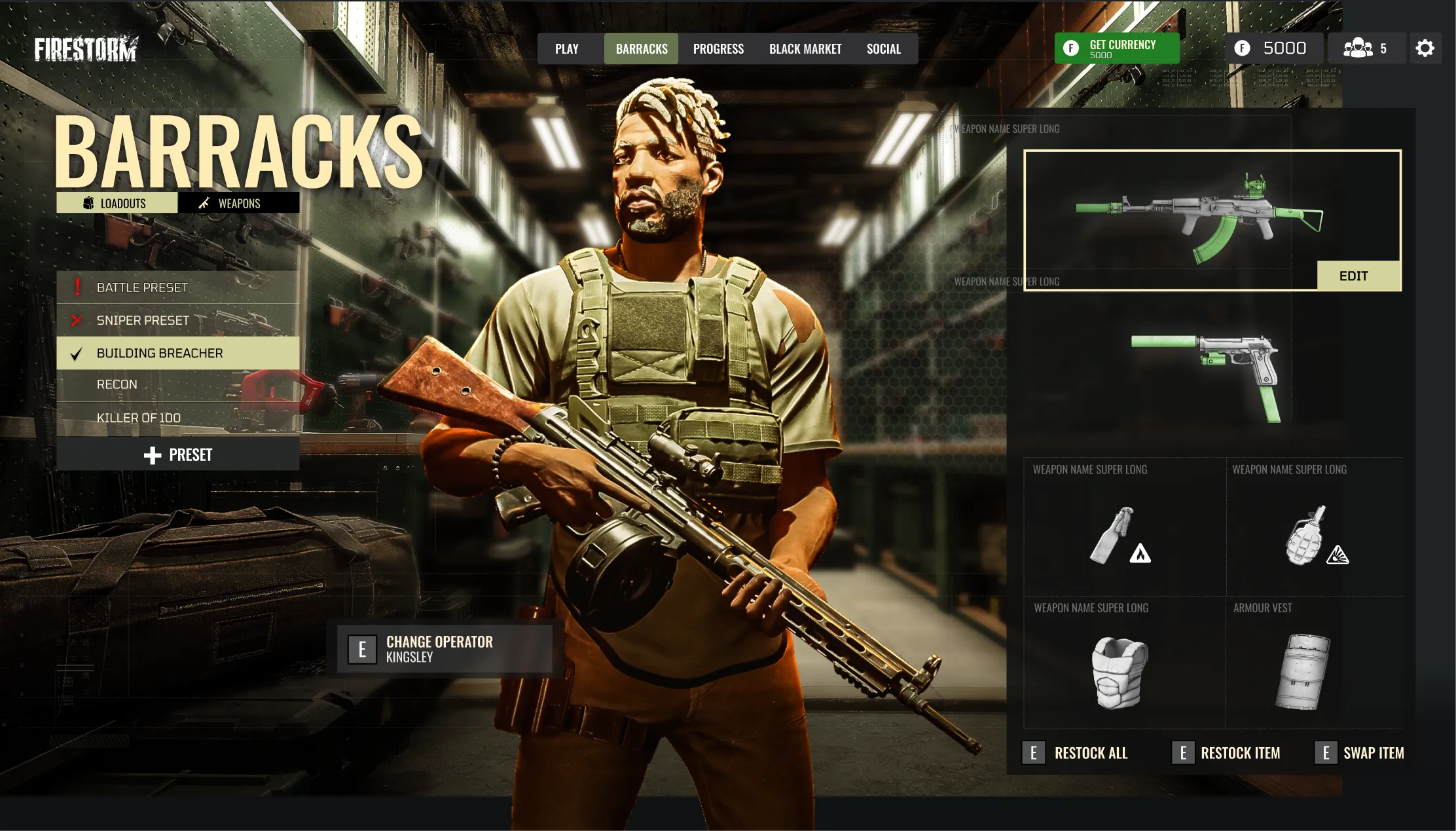
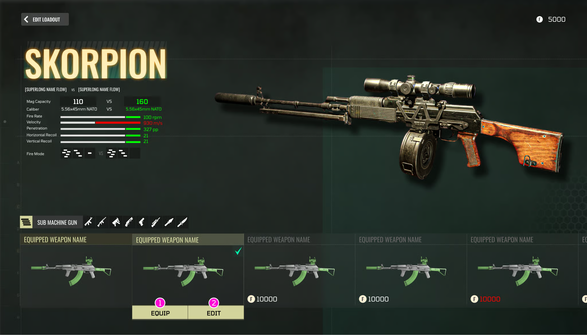
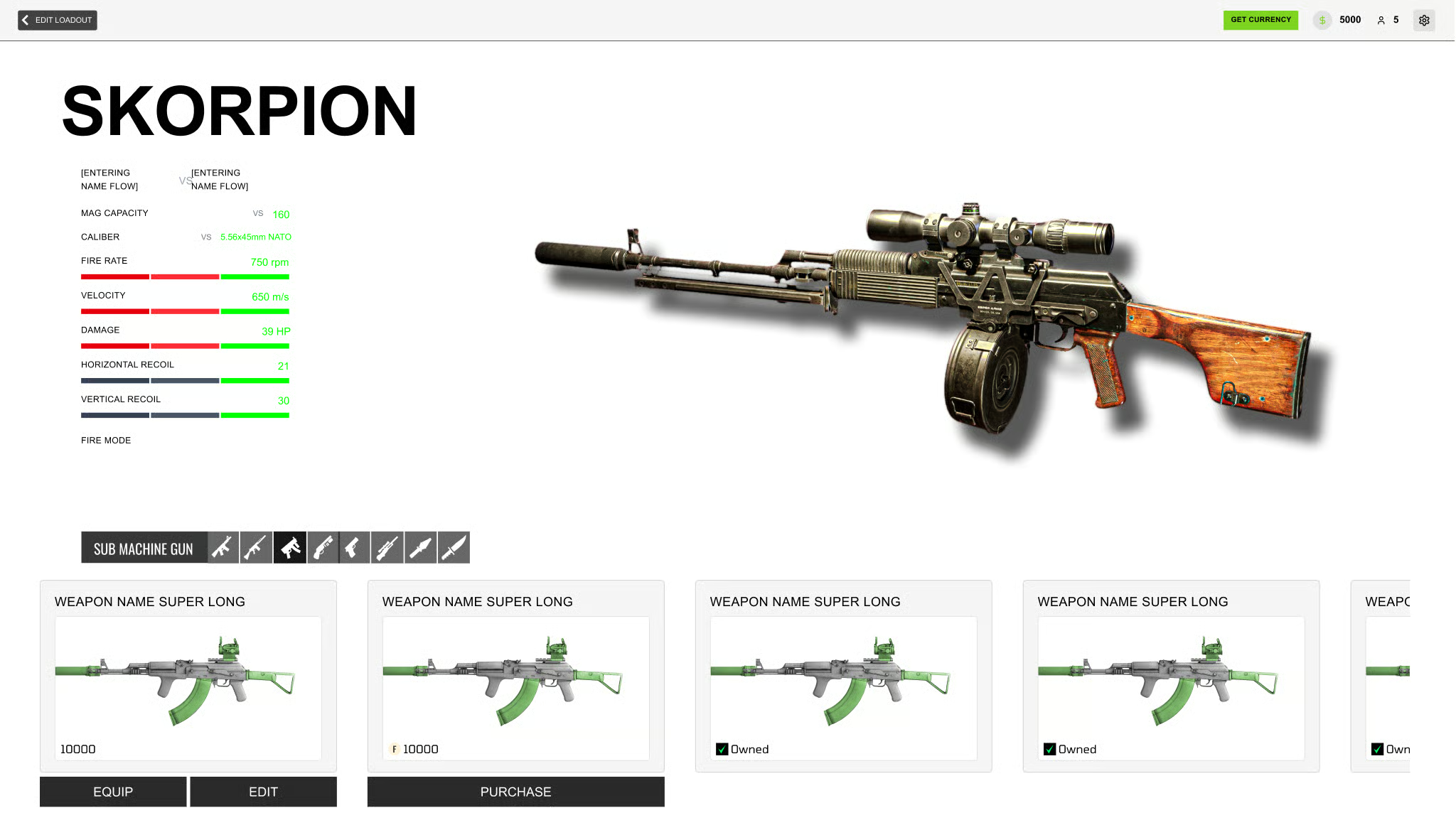
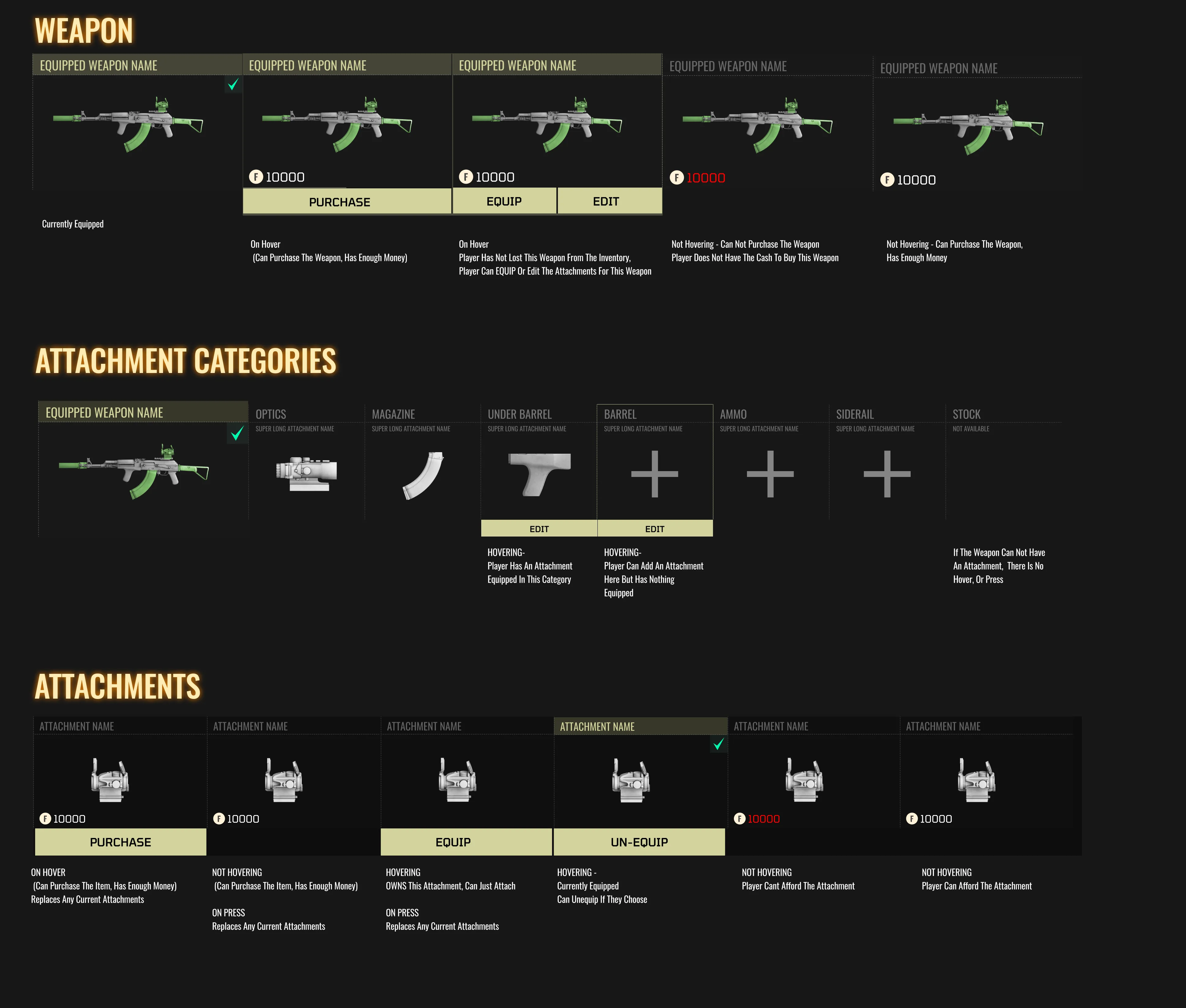
Weapon Customization Interface
I had to "Art out" these screens in just 2 weeks as our studio was desperate to provide saber with an update.
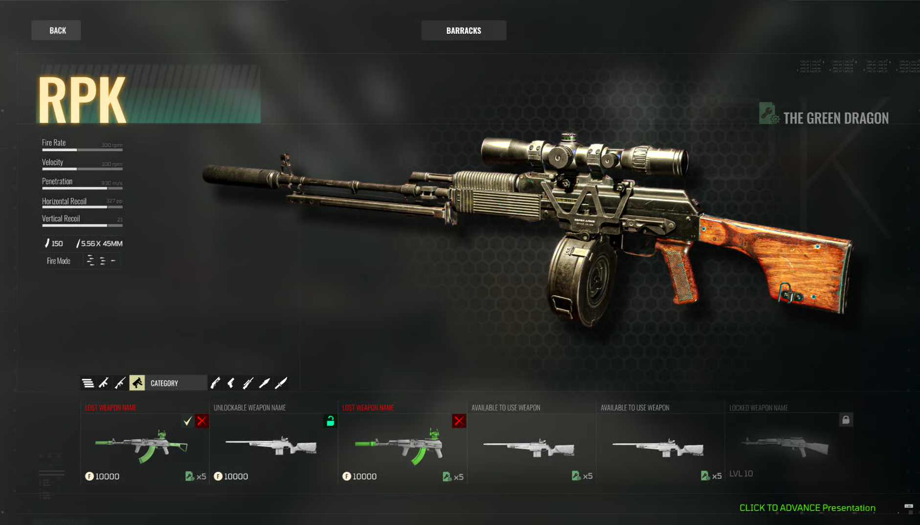
Weapon customization interface with attachment and mod options.
Detailed weapon stats and loadout configuration screen.
Wireframe layout for the weapon customization flow.
Wireframe detailing attachment selection and stat comparison.
WireFraming
All designs were first created as wireframes.
Initial wireframe exploring screen layout and information hierarchy.
Wireframe iteration refining navigation and interaction patterns.
Mode selection wireframe with streamlined user flow.
Refined mode selection wireframe with reduced decision complexity.
Style Guides / Widget Breakdown
To stay organized and ensure clear communication with the developers, I developed a straightforward style guide. This guide outlines the preferred styles and includes a widget sheet that details the various usages and states of different widgets.
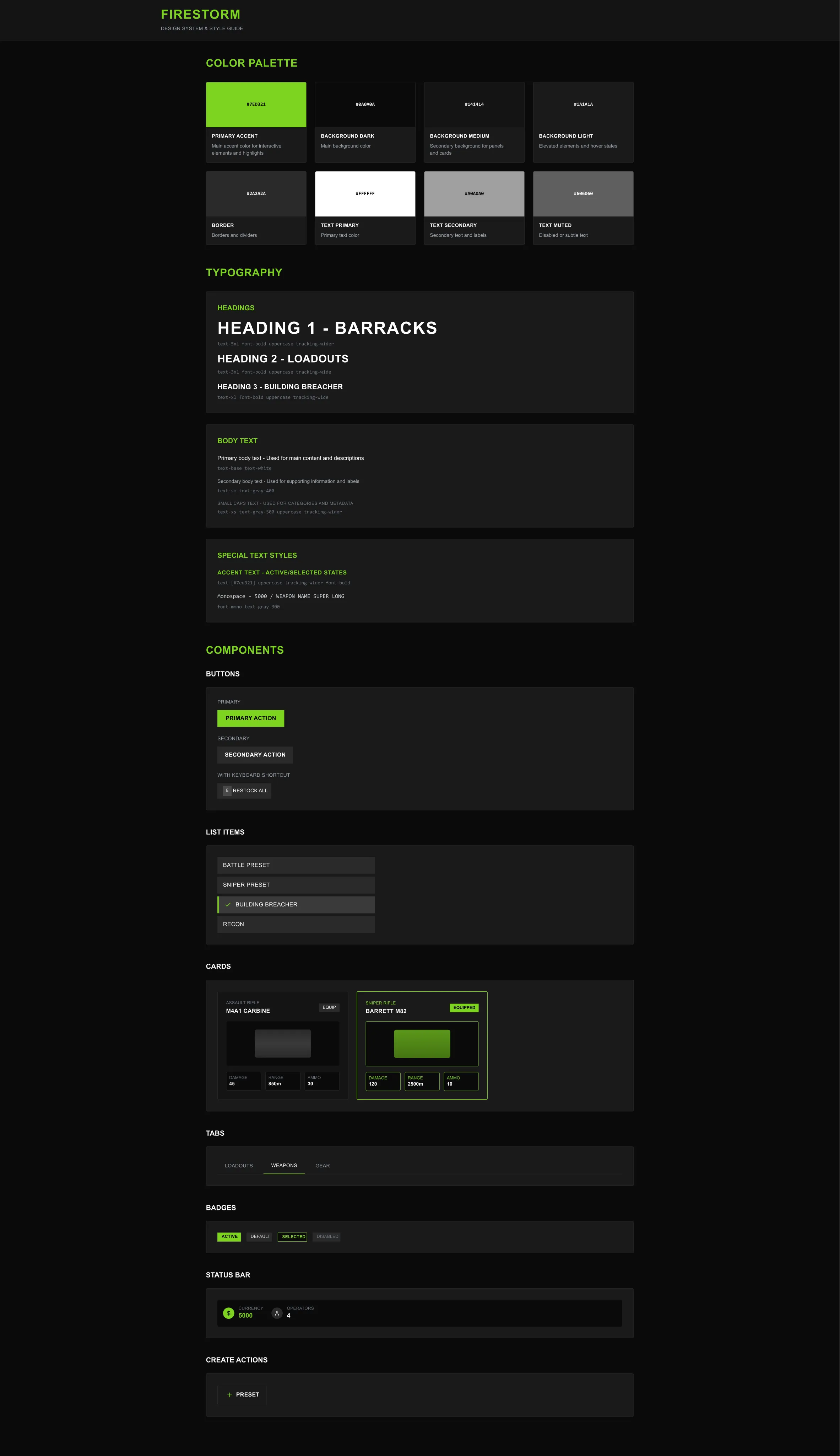
Style guide defining colors, typography, and component standards.
Widget sheet detailing component states and usage guidelines.
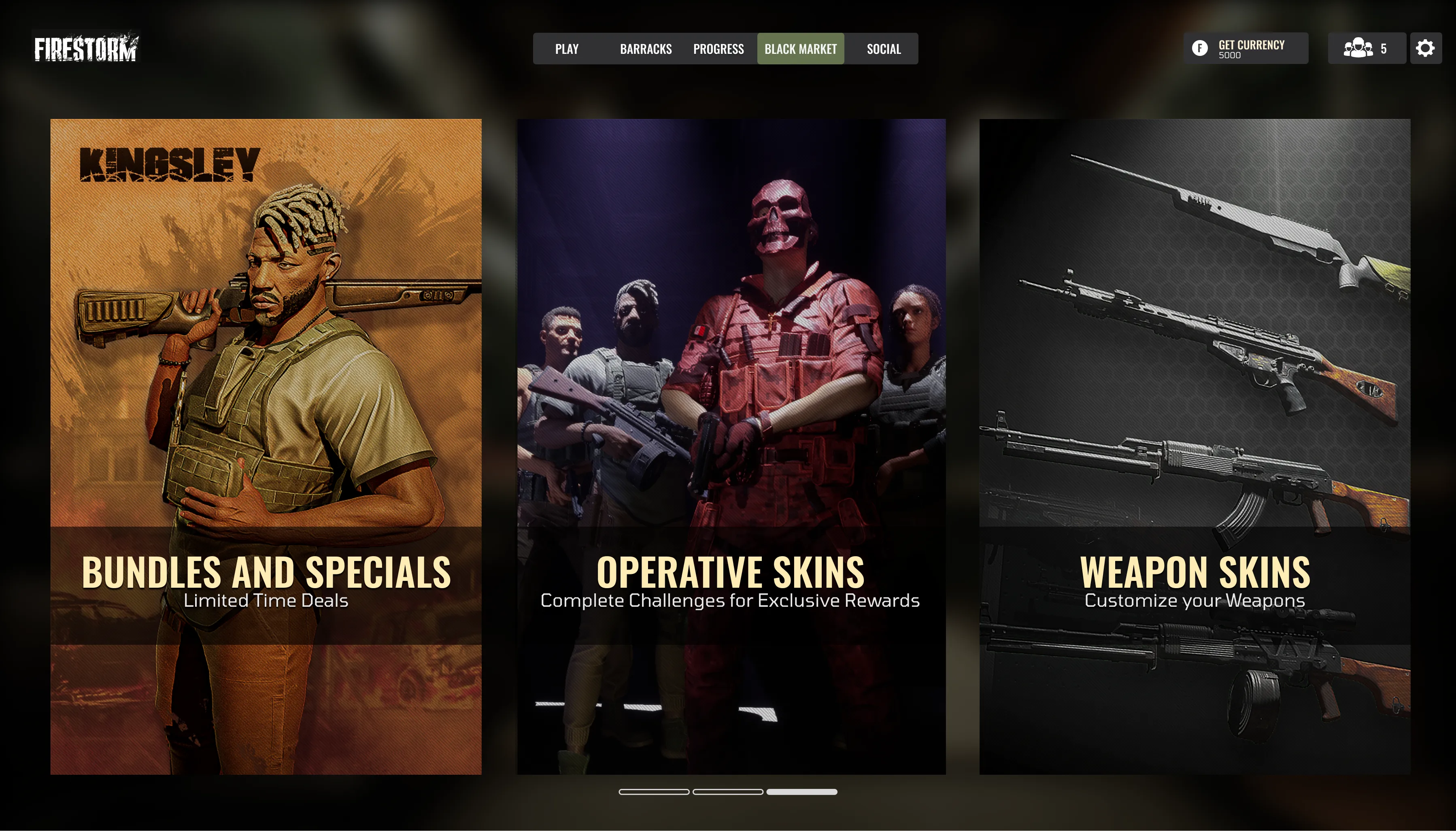
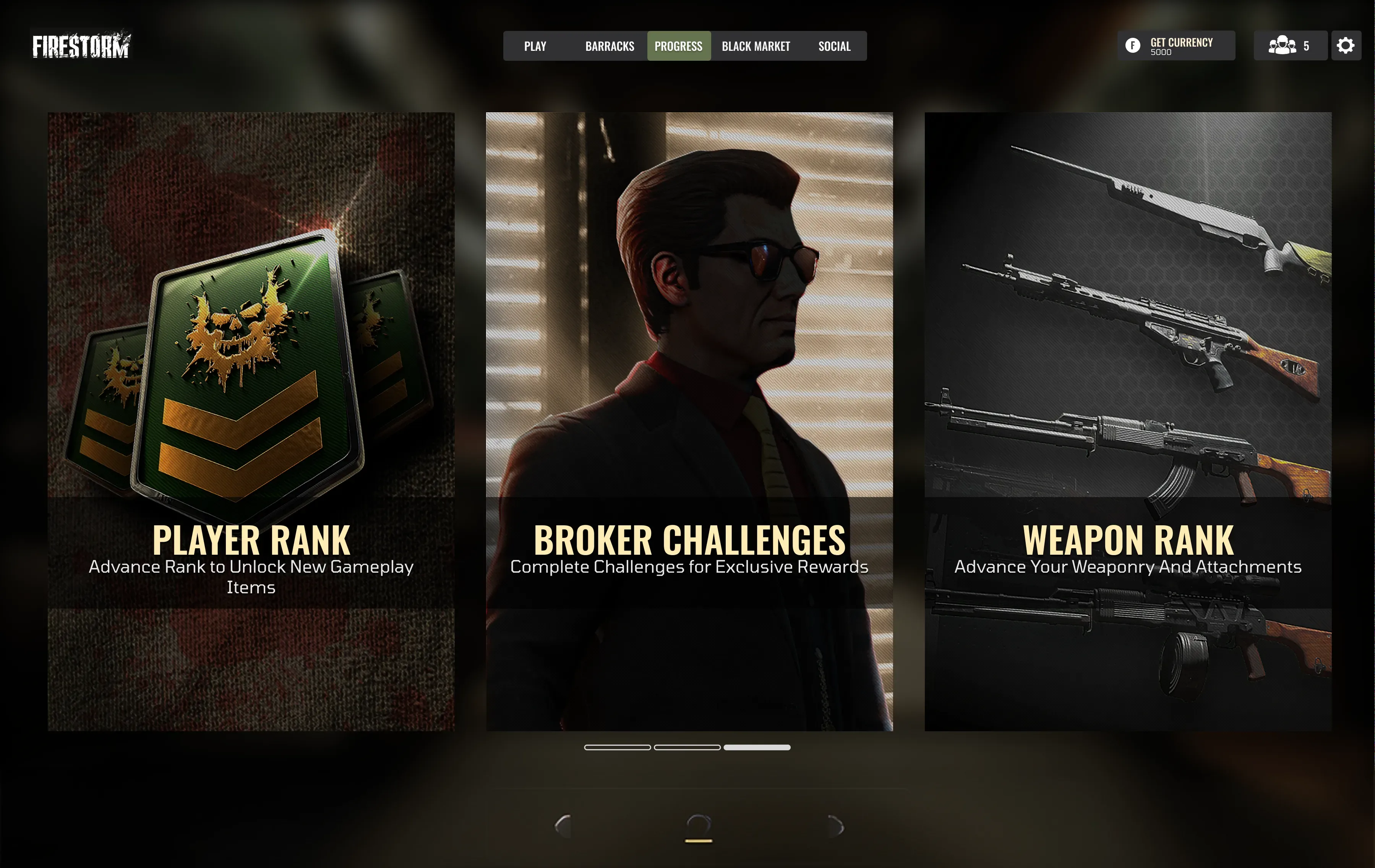
Mode Selection Screens
The main idea behind the search screens was to minimize the number of choices users face when navigating different modes. I aimed for users to arrive at the screens, encounter a limited selection of options, and quickly move through the interface. It was tested, and feedback was overwhelmingly positive.
Mode selection screen with minimal options for quick navigation.
Game mode details with match configuration options.
Search and matchmaking interface with streamlined flow.
Lobby screen with player readiness and squad management.
Map Graphics
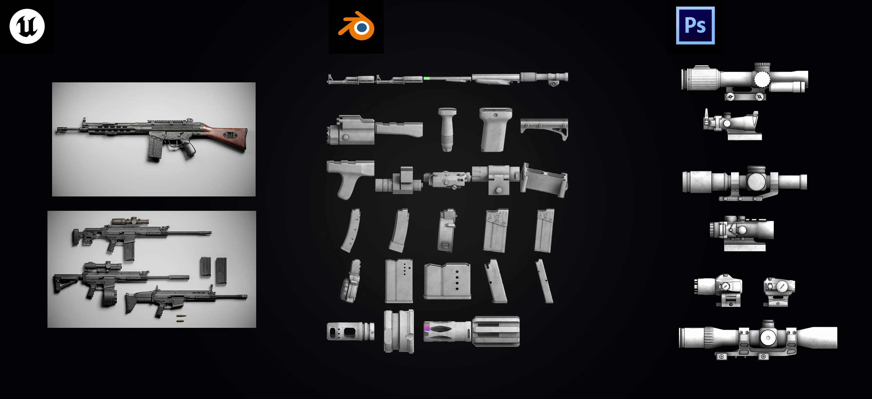
How did I make a full set of game attachment icons in 3 days? I automated the pipeline.
- Unreal: Ready Assets were exported from Unreal, then exported to Blender.
- Blender: Python script that automated application of a toon shader + outline (Grease Pencil/strokes) Then batch render + auto-crop.
- Photoshop: A script batch-applied layer effects to make icons pop.
Back in Unreal: set registration points per weapon/slot so the UI shows attachments accurately.
The outcome allowed us to effectively replicate the unreal attachment points using 2D assets. Our ultimate objective was to develop an unreal shader; however, at that moment, it proved to be too challenging for us to pursue. It was an intriguing problem to tackle, and the solution was quite complex.
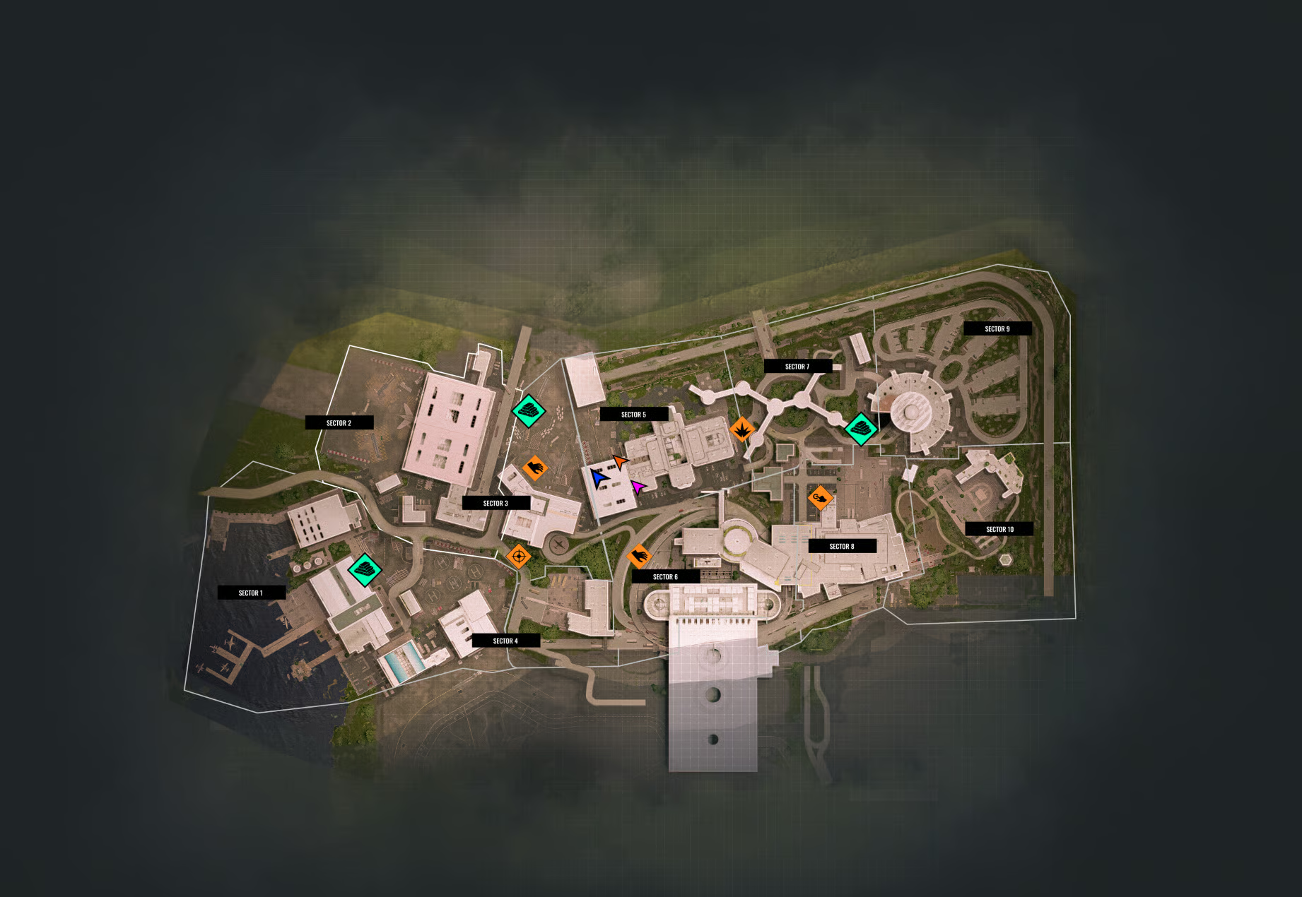
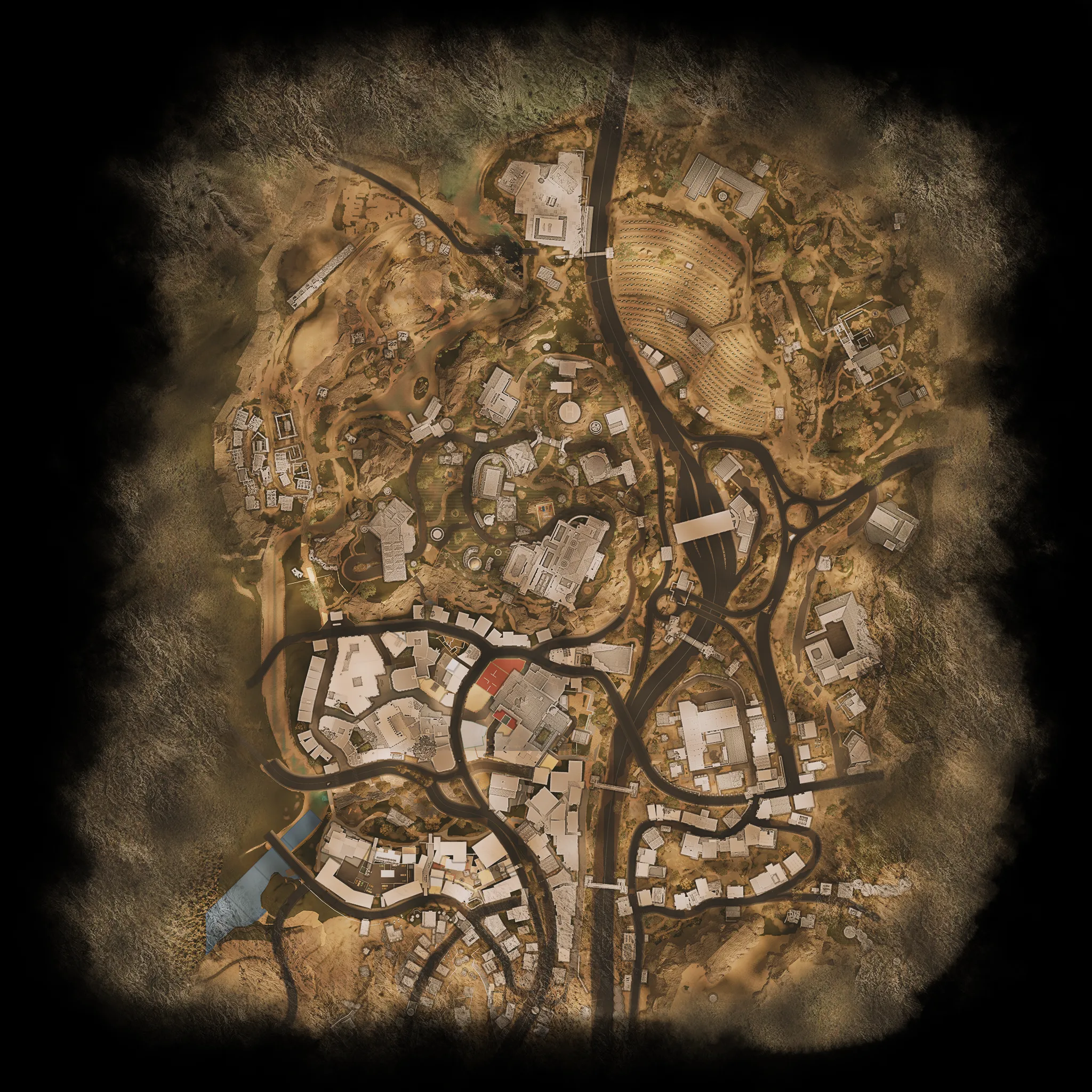
Map Graphics & Objective Icons
I was also responsible for creating the map graphics and integrating all the icons representing different mission objectives, clearable locations, and gameplay sections. Each map was prepared in Unreal, exported out, then composited and painted in Photoshop to achieve the final look.