UX Case Study
Chore Buddy
A one-line positioning statement — what Chore Buddy is and who it's for.
The Problem
An app to control kids' game time
ChoreBuddy was built to manage kids' game time on two fronts: a game firewall enforces the limit, while a reward system lets them earn more by completing chores.
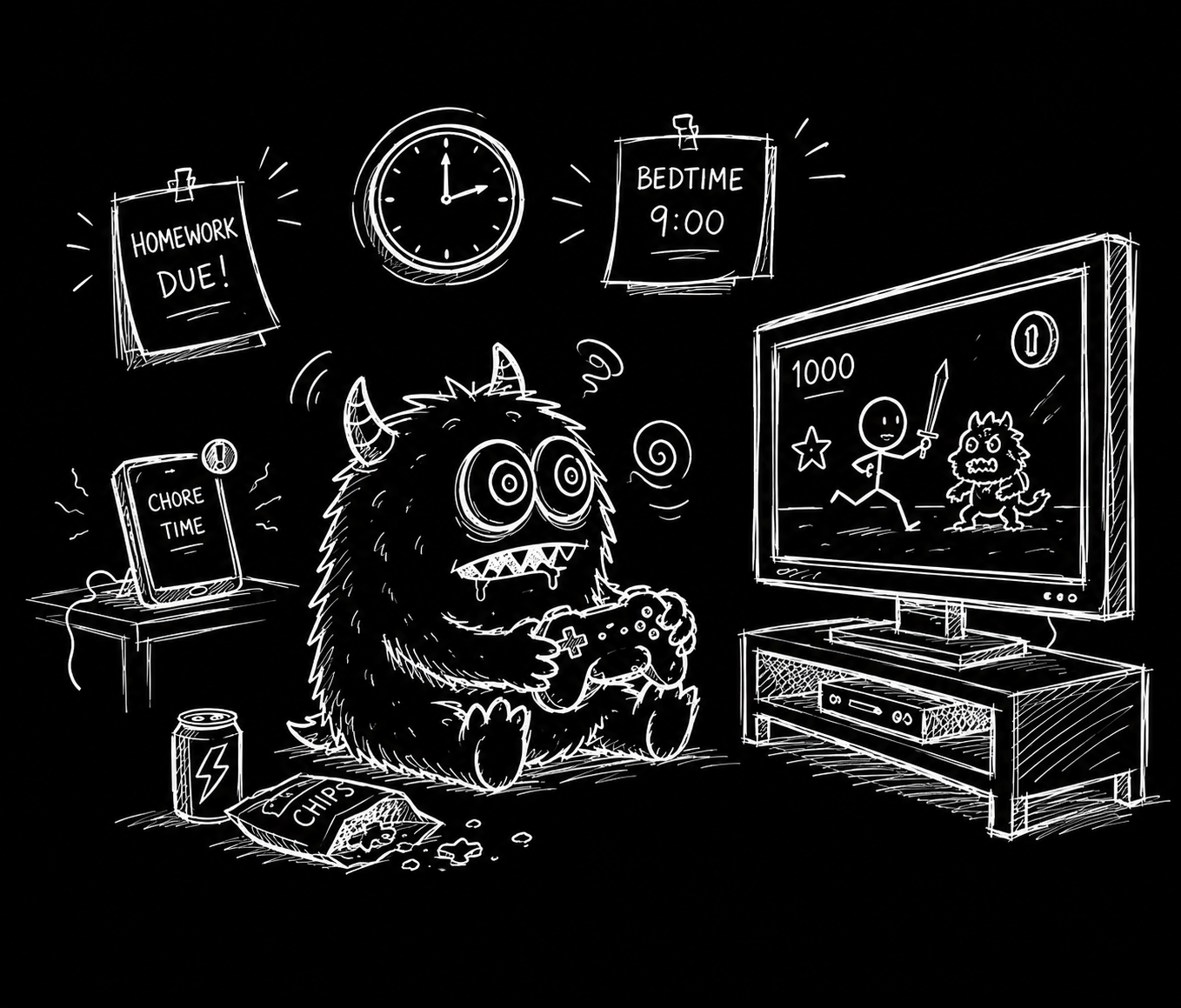
My kids spent all day playing video games.
The Solution
Create a Task based Reward System
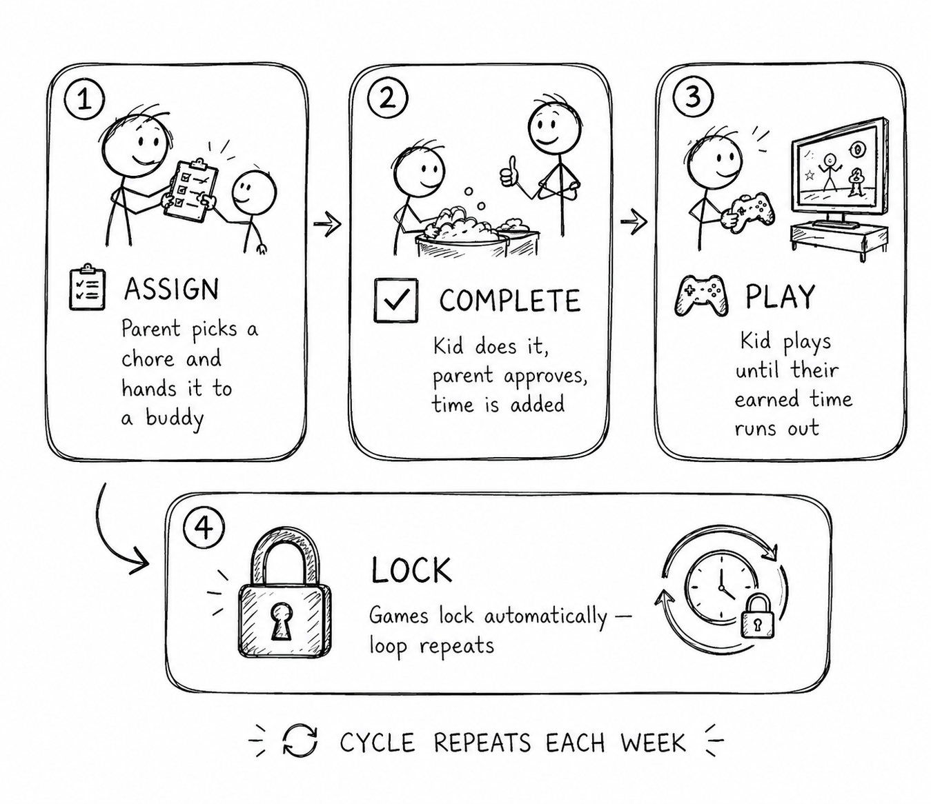
Kids only get game time when they earn it through chores.
Kids earn game time by completing assigned chores
Parents set the weekly cap — games lock when it's hit
The cycle resets automatically each week
The Product
Task Manager
Web
Mobile
Game Firewall
Making the reward system work took two parts: a mobile app that tracks chores and pays them out as game time, and a desktop client that enforces the limit by blocking games on the kid's PC.
Tap a screen to open the gallery
Testing
3 Families
3 Months
Were asked to participate in a trial run of the app.

The Van Dyck's
Adam & Felicia — accountant and UX designer — with sons Riley (15) and Charlie (13).

The Brideaux's
Shehawn & Neil — developer and social media manager — with son Rob (12).

The Peetz's
Steve & Denise — net admin and realtor — with daughter Zoey (13).
Testing
Feedback
(Quantitative)
Each family was sent a questionnaire to gather feedback.
✦ Parents
"Easy to set the hours — fair, not forced."
Van Dyck
"Auto-lock meant I stopped policing screen time."
Peetz
"Make it simpler — it took too long to learn."
Brideaux
"Too many steps just to get going."
Peetz
✦ Kids
"Earning time felt fair — I knew exactly what to do."
"Kind of satisfying watching my time go up."
"It shut my game off without telling me why."
"I'm always doing chores."
Testing
Feedback
(Qualitative)
As families used the app, usage analytics were quietly collected and stored — data we could compare and vet against the feedback, so what people told us was always backed by what they actually did.
View Dashboard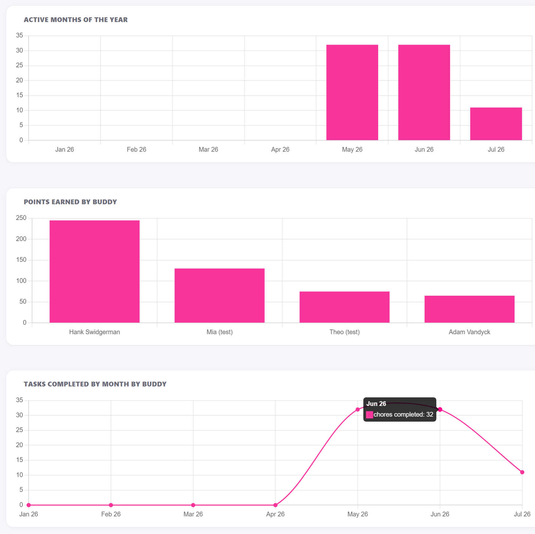
Testing
Testing outcomes
✦ The Good
✦ Room to grow
What's Next
Flip the loop. Let kids drive it.
Instead of waiting on a parent to start the loop, kids can ping a parent right from the app — to ask for more game time, or to request a chore so they can earn it. Their own motivation drives the cycle.
"The kids' motivation becomes the product's engagement engine."
The loop, reimagined
Old loop — Parent push
Iteration Two
The setup was too hard — so we let AI build it.
Parents just talk. Gemini turns a spoken sentence into ready-made chore cards for every kid — the entire first-run setup, generated in seconds and easy to tweak.
View Flows ↗ View Chore Builder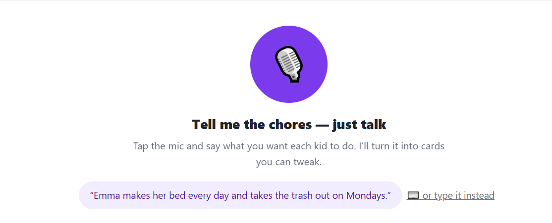
✦ Gemini turned that into…
Make bed
Emma · Daily
Take out trash
Emma · Mondays
Load dishwasher
Max · Daily
Feed the dog
Max · Daily
Vacuum lounge
Emma · Saturday
Homework check
Max · Weekdays
Click Analysis
Every routine action, counted from Home.
I profiled the tasks each role does most and counted the minimum taps from their Home screen. Reminders arrive as deep links — so from a toast or message, the same action collapses to a single tap.
View Flows ↗Next Steps
Let AI run it — and remove the UI.
We're strategizing how to connect AI to surface and sort the most important activities each user needs to act on — and, ultimately, to remove the interface completely, so the app works for you without screens to navigate.
Where we're headed
AI prioritization
Ranks and surfaces the activities each user actually needs to act on.
Ambient & conversational
Act by a nudge or a sentence — not by tapping through screens.
Remove the UI
The end goal: no interface at all — the app just handles it.
Role
[Solo — UX & Dev]
Platform
[React Native · iOS/Android]
Timeline
[e.g. 2025]
Status
[In Development]
Introduction
Chore Buddy started at my kitchen table.
My kids' gaming had crowded out almost everything else. Instead of just adding rules, my wife and I built an app together: parents assign chores, and game time is earned by doing them.
It reframes chores from nagging into the path to the reward kids actually want.
The Challenge
The challenge wasn't stopping play — anyone can take a controller. It was motivation: getting kids to want chores without it feeling like punishment.
From punishment → motivation
Make kids want to do chores, not dread losing time
From restriction → reward
Turn game time into something earned and fun
My Role & Process
I owned this end to end — idea, UX, build, and testing.
•Designer, not an engineer — normally, shipping a real app would be out of reach.
•Built it with vibe-coding + AI code-assist: described screens in plain language, let Claude generate the React Native, dropped into hands-on coding where precision was needed.
•Always a live prototype, never a mockup — hooked to Firebase on real data (real chores, points, game time) from the first screen.
•Wiring to live data is the hard, valuable part — it lets a prototype inform a decision, not just look like one.
•Ran as a tight build-measure-learn loop, with my own household as the test lab.
Information Architecture
Two realities shaped the structure: how parents want to use it, and where the software has to live.
How parents use it
•Quick: add or cut game time — up front, no setup.
•Deep: create & assign chores — only when you want to.
Where it lives
•Phone app — the parent controls everything.
•Desktop app — on the kid's PC; enforces limits, locks games.
•Firebase — syncs both in real time; they never talk directly.
Key User Flows
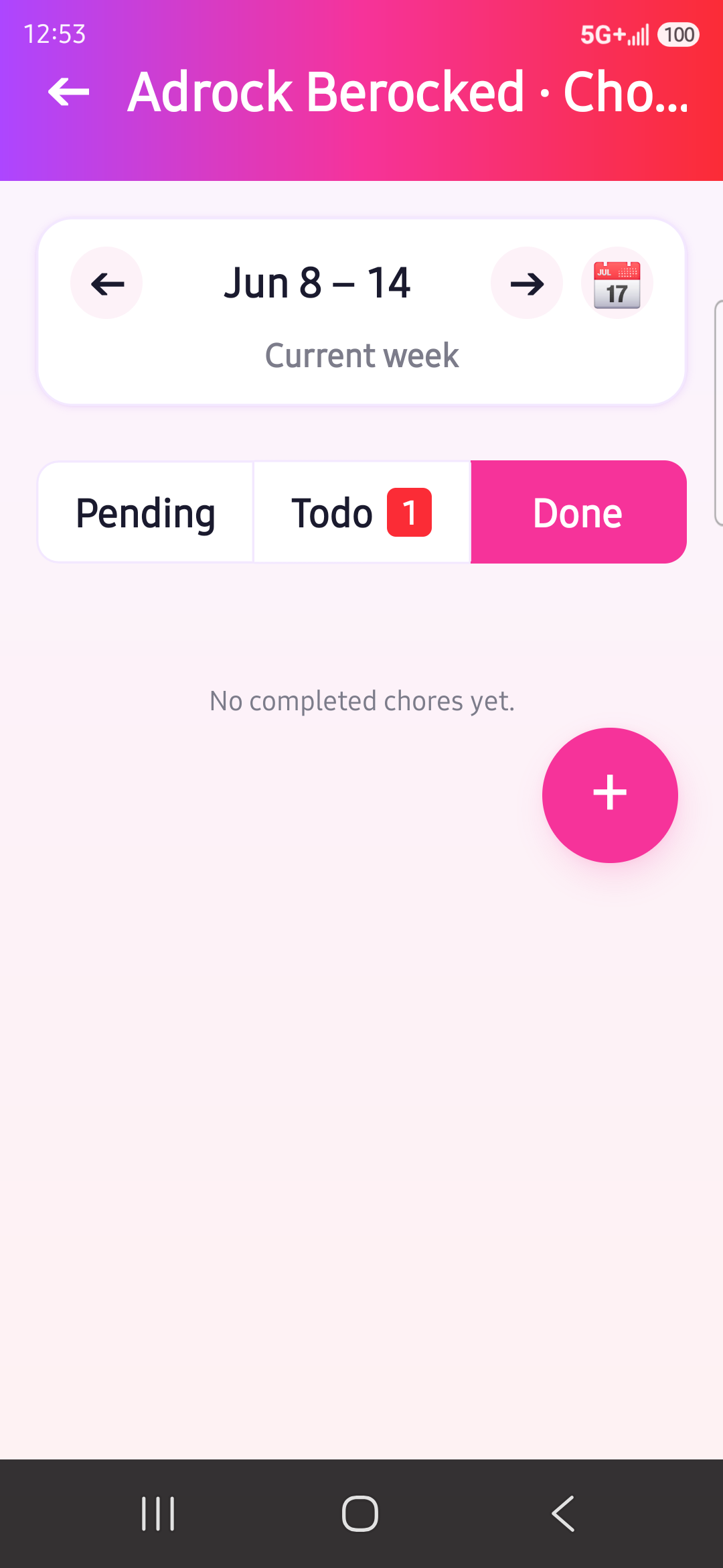
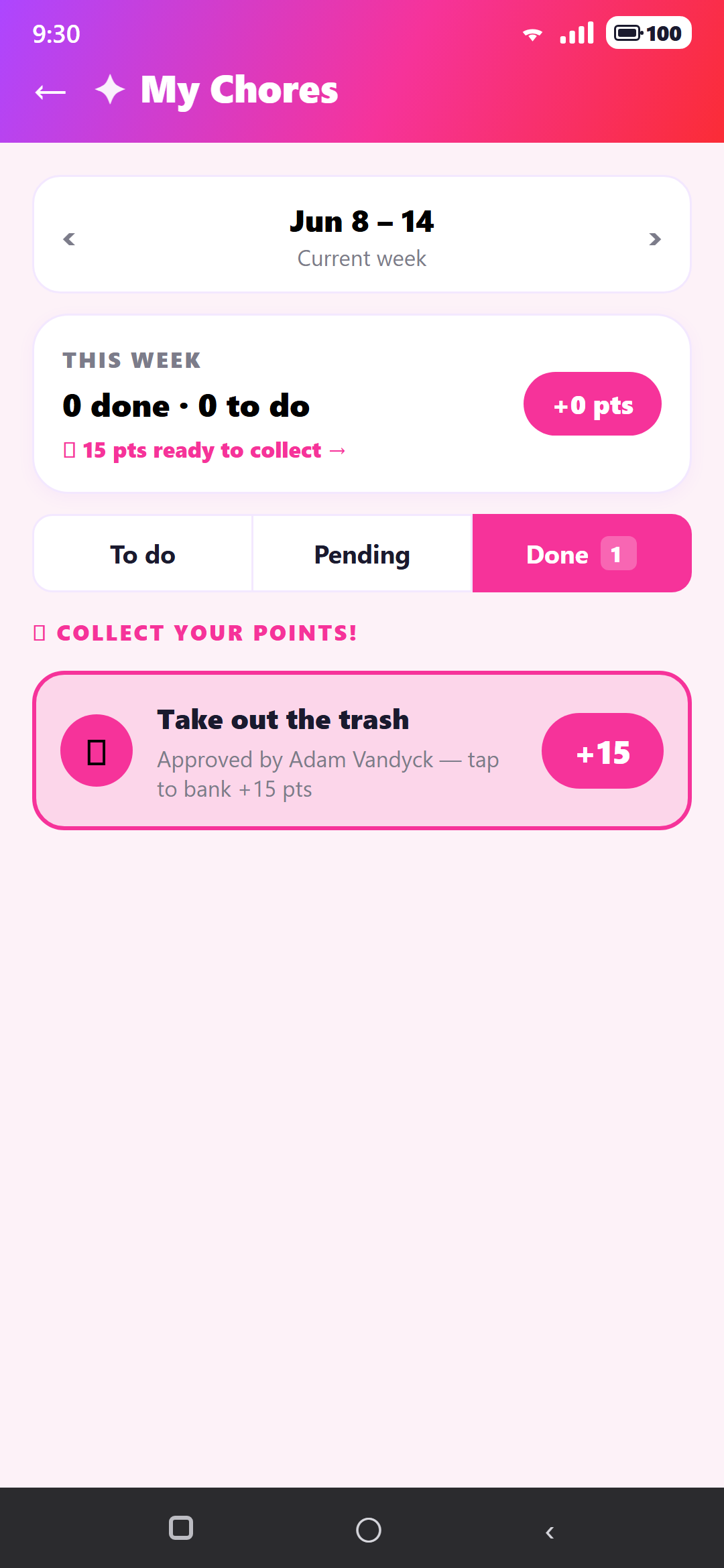
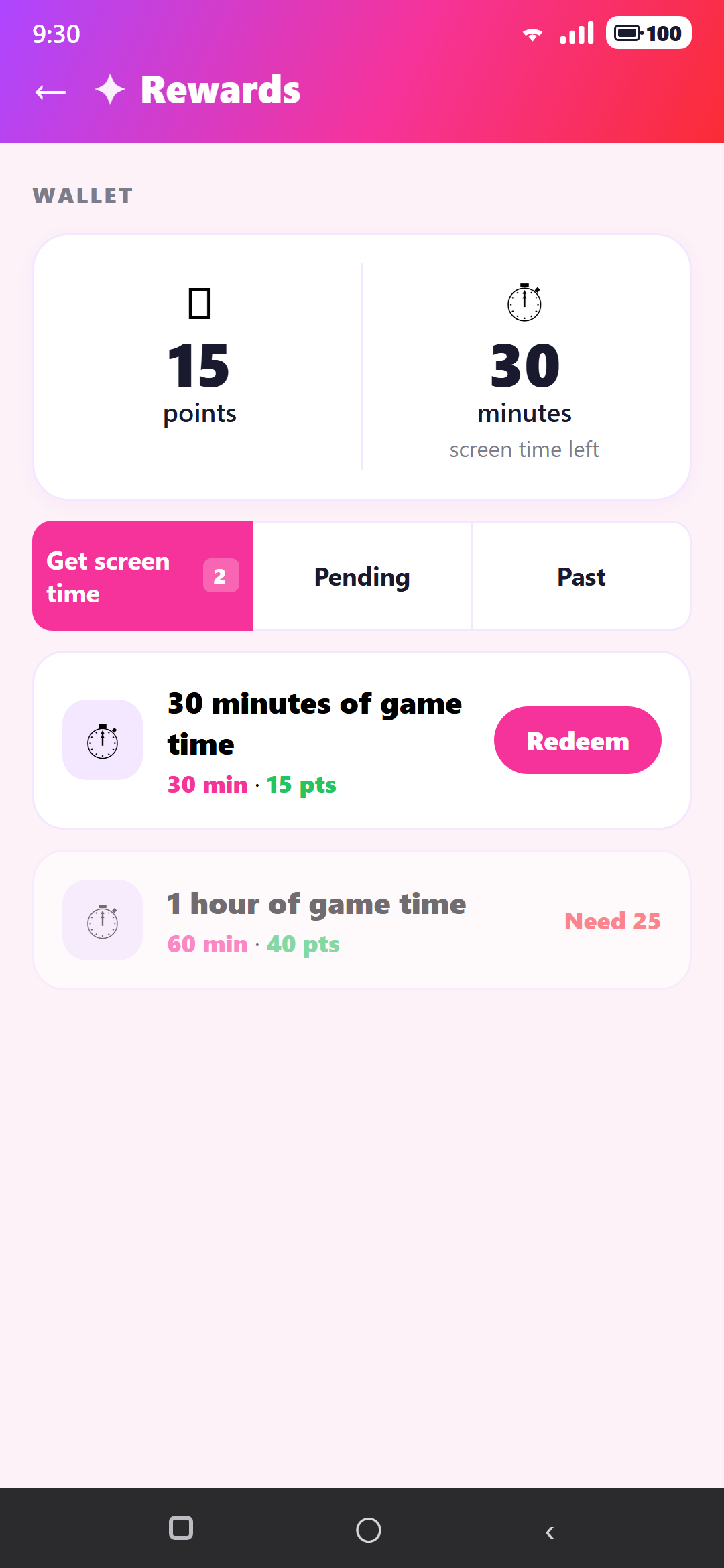
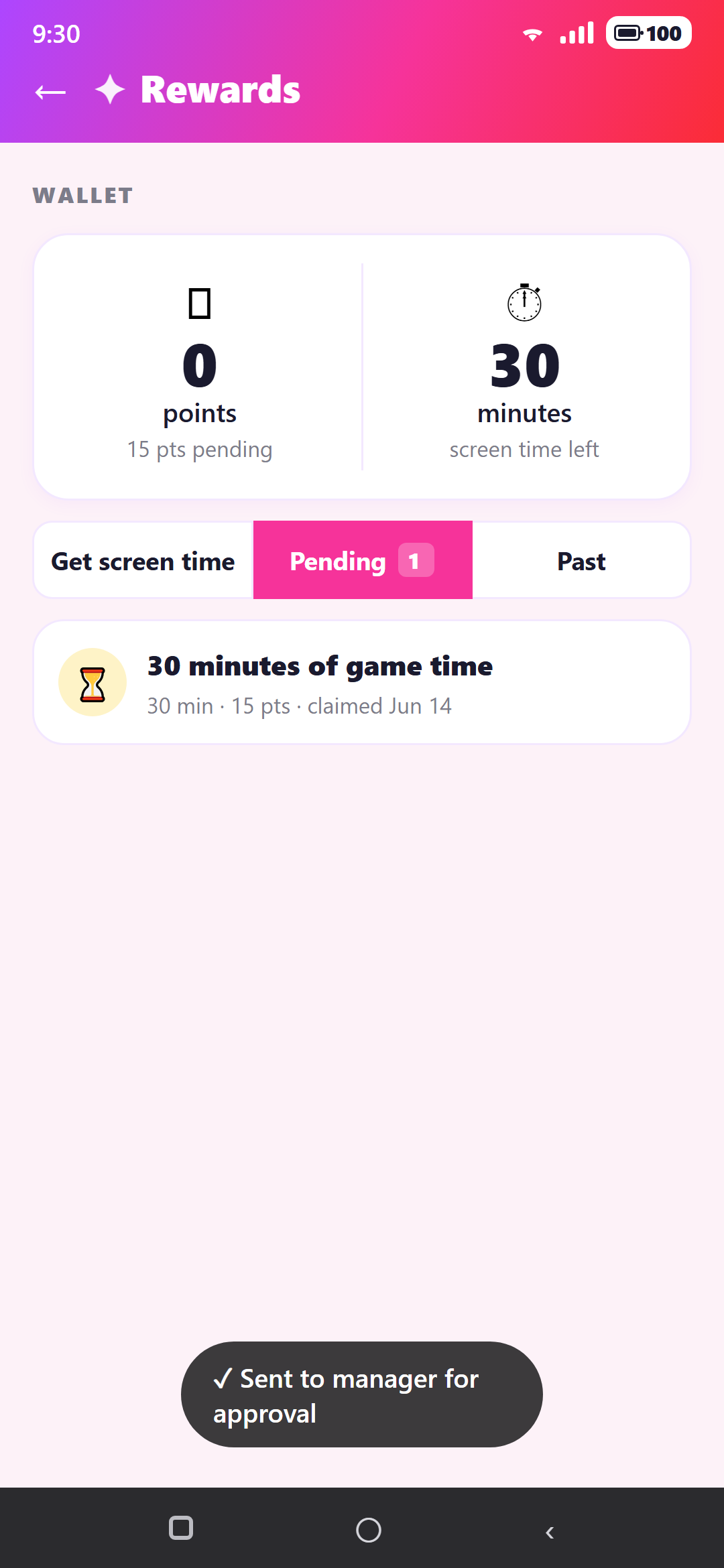
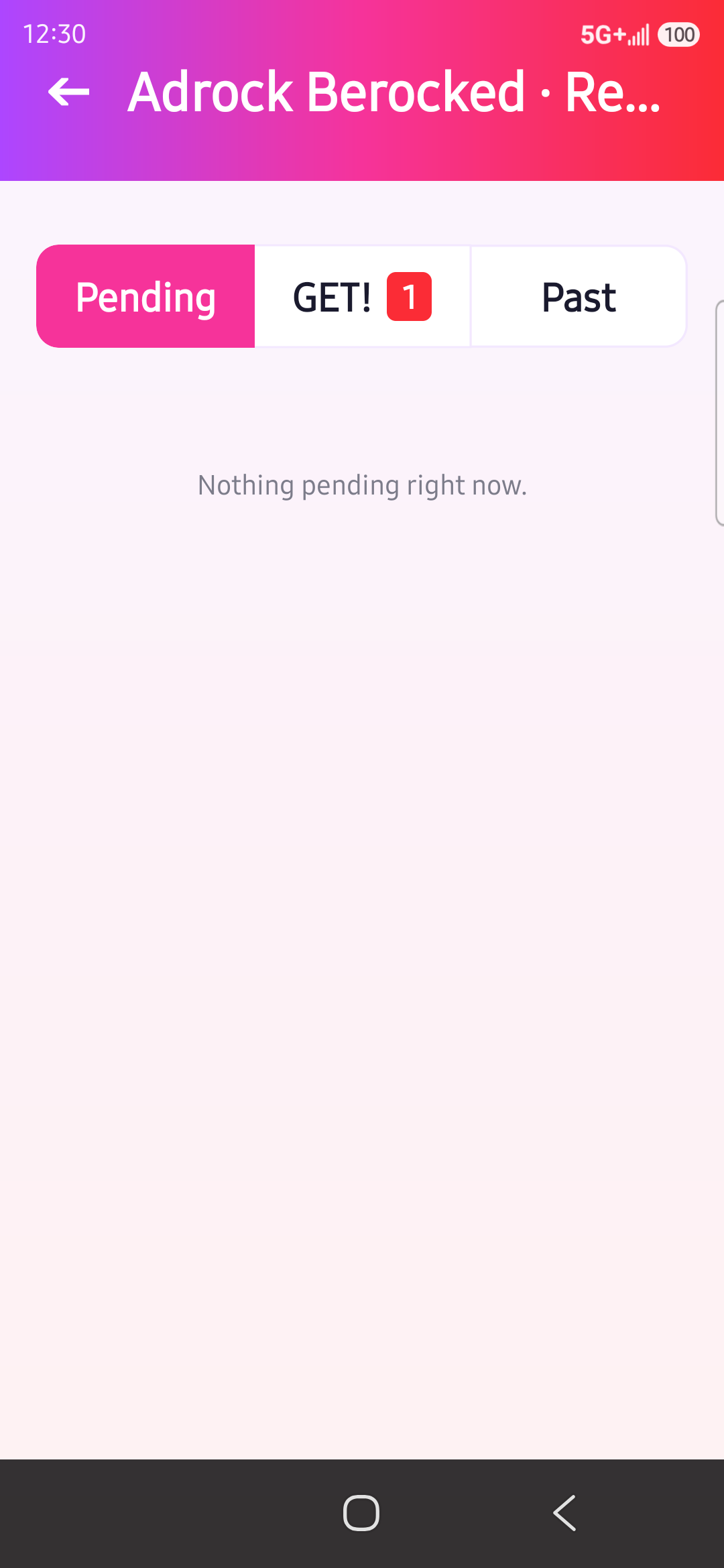
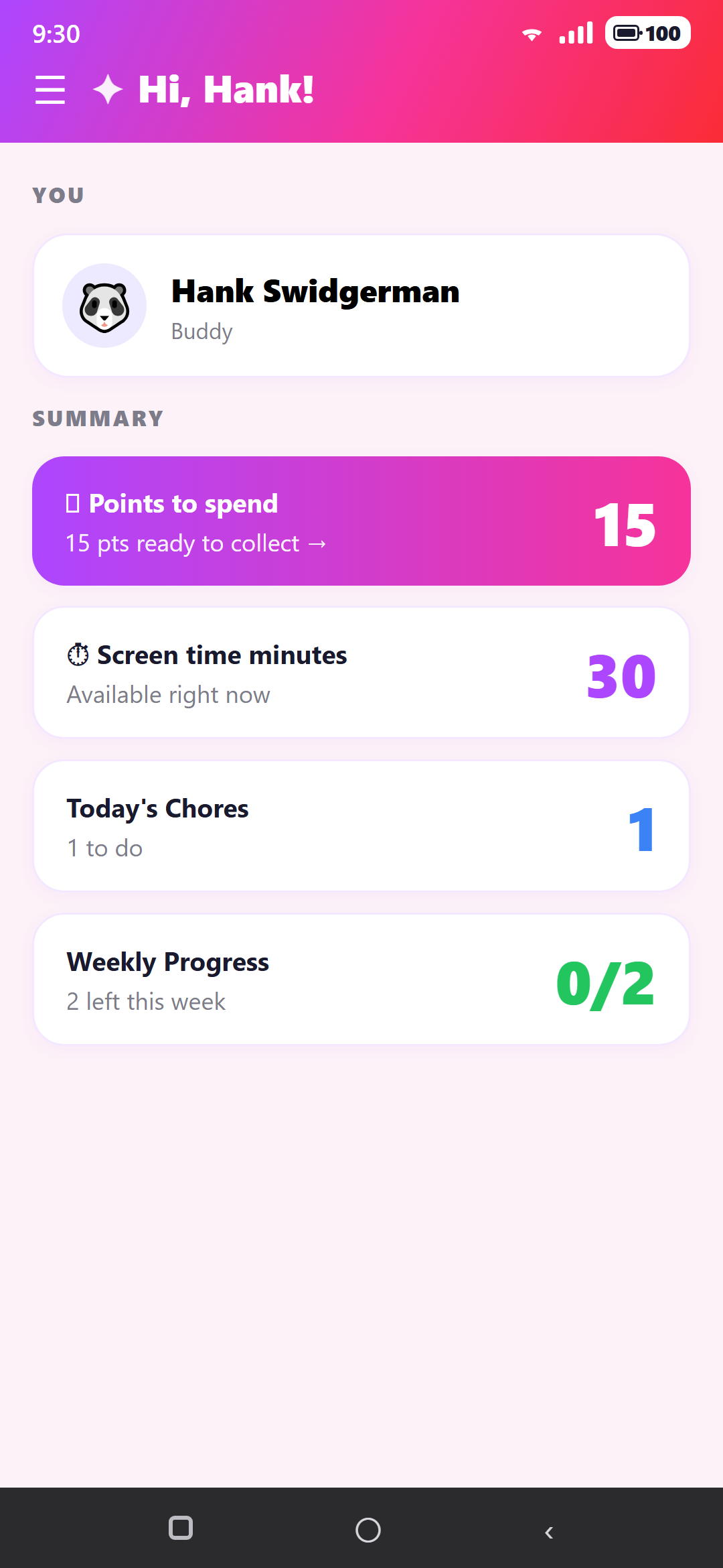
Three flows carry the whole product, and each one crosses between the Manager and the Buddy. Together they form the core loop: a chore gets assigned, completed and approved for points, then points are cashed in for extra screen time.
1 · Assigning a chore — Manager → Buddy
The manager builds a chore in the shared pool and hands it to a buddy.
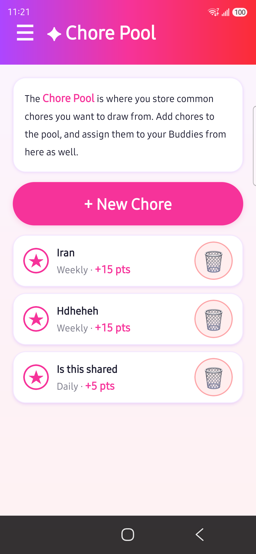
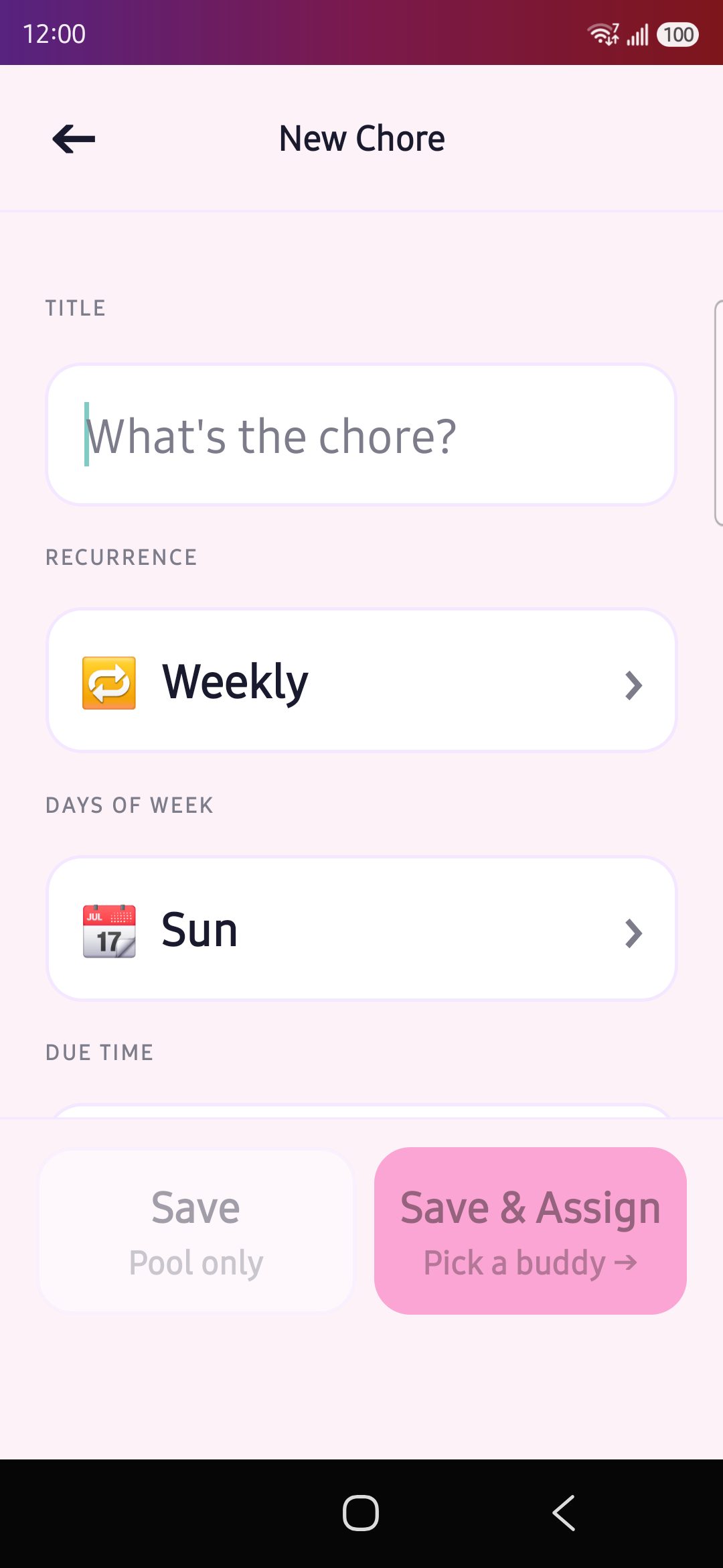
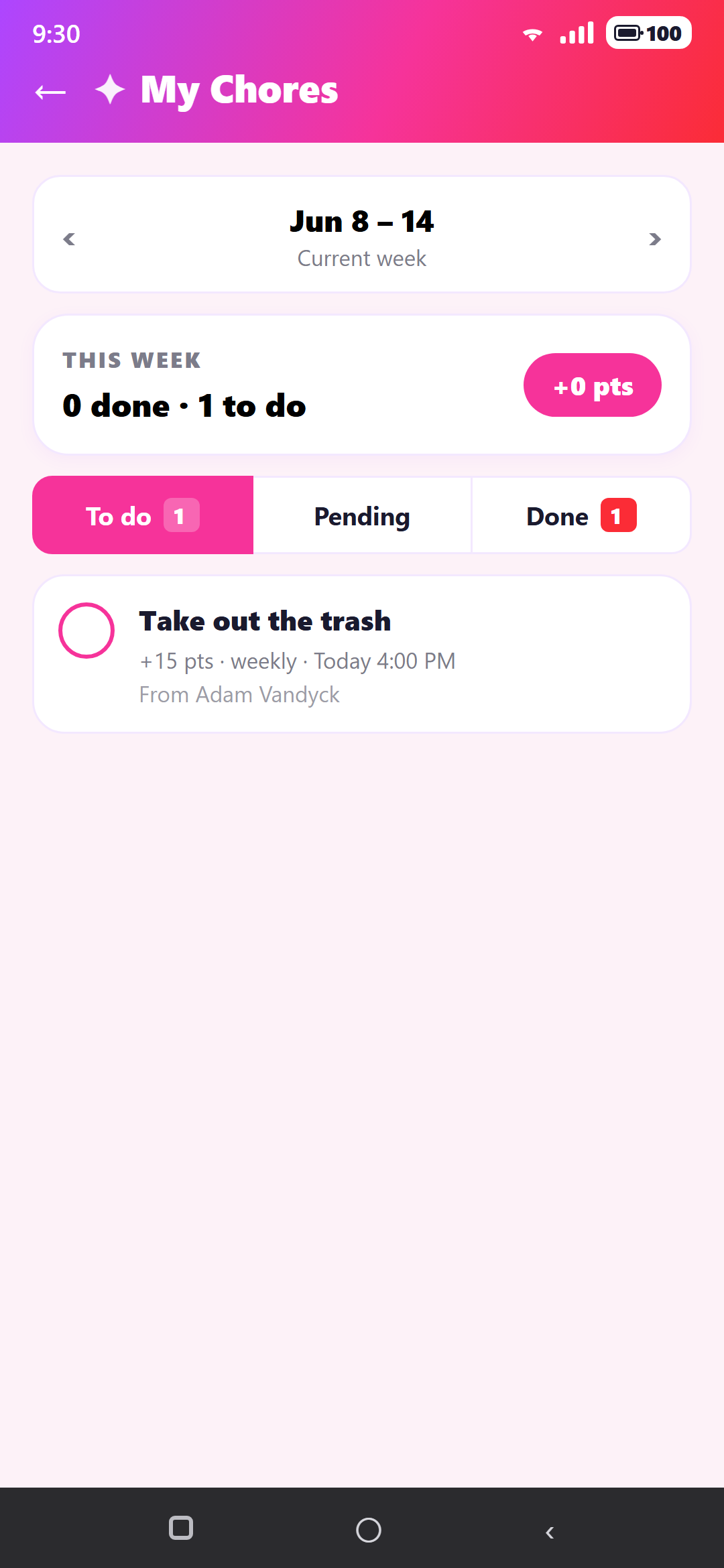
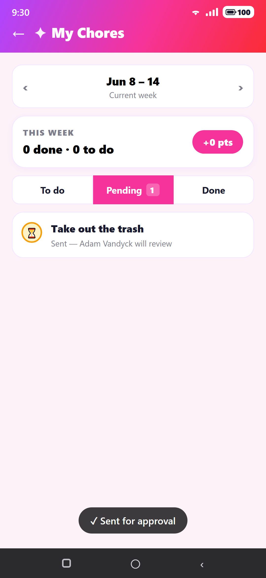
2 · Completing a chore — Buddy → Manager → Buddy
The buddy does the work and sends it for review; the manager approves it and the points become collectable.
3 · Redeeming points for screen time — Buddy → Manager → Buddy
The payoff: a buddy spends earned points on extra game time, the manager fulfils it, and the minutes land in the buddy's balance.
Two Roles, One Household
How the Manager and Buddy experiences differ, and why the IA keeps them in sync.
The Game Firewall
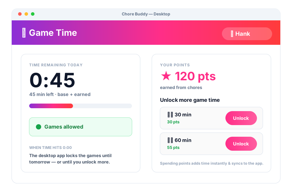
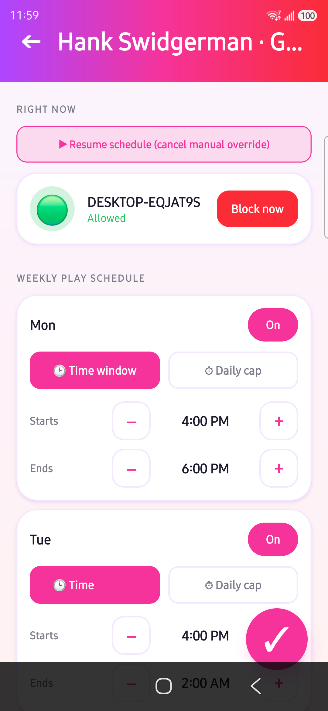
Rewards only matter if there's a floor for them to sit on. That floor is the game firewall: a base amount of game time each buddy gets every week, set by the manager and enforced on the kid's computer by the desktop app.
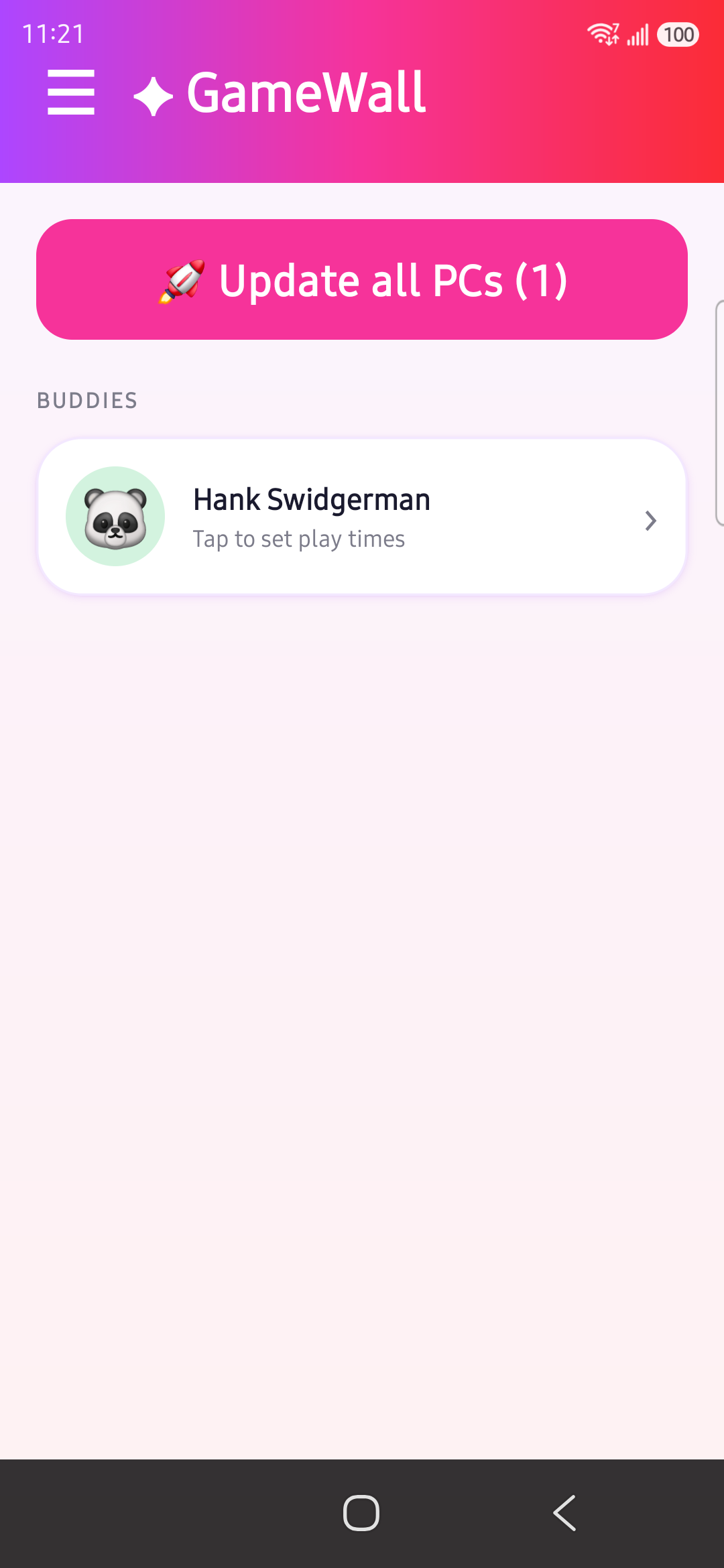
From the GameWall, the manager sets a weekly play schedule per buddy — a time window or a daily cap for each day of the week. That schedule is the base allowance. Time earned from chores then stacks on top of it. When the combined total is used up, the desktop locks the games; the base resets at the start of the next week.
Backend & Data — Firebase
Chore Buddy runs on Firebase Auth (sign-in) and Cloud Firestore (data). Firestore is the shared source of truth both apps read from and write to — every screen subscribes with real-time onSnapshot listeners, so a change on the phone shows up on the kid's PC within moments, and vice-versa.
The model is flat: a handful of top-level collections, and every document carries a familyId so one household only ever sees its own data. The phone reads and writes everything; the desktop agent only touches the three collections that drive enforcement.
gameSchedules + firewallControl and reports time used to screenTimeBurns; the phone owns everything else.Document shapes
users/{uid}
familyId, role: manager | buddy
displayName, avatar, age
minutesRemaining   // screen-time wallet
assignedMachineId  // bound PC
chores/{id}
familyId, title, assignedTo
status: todo → pending → approved
points, dueDate, weekOf
collectedAt        // points banked
rewardClaims/{id}
familyId, kidId, rewardTitle
cost, minutes
status: pending → approved
claimedAt, resolvedAt
gameSchedules/{buddyUid}
familyId, buddyUid
days: { mon … sun: {
  enabled, mode: window | cap,
  start, end, maxHours } }
Keeping reads (and the bill) down
Firestore bills per document read, so a naive “check every few seconds” loop would burn through the quota fast — and the desktop agent, which needs to know the moment a rule changes, is exactly the kind of client that invites constant polling. The fix was to never poll at all and let Firestore push instead.
•Listeners, not loops. Every screen and the desktop agent use real-time onSnapshot subscriptions. Clients react to pushes — no interval get() calls re-reading unchanged data.
•Narrow the query. Reads are scoped with where('familyId', …) (and by week/buddy where it helps), so a snapshot only ever delivers the household's docs, not the whole collection.
•Doc-level listening on the PC. The desktop agent watches just its own firewallControl/{machineId} doc and the buddy's gameSchedules/{buddyUid} — two documents, not a collection scan.
•One listener per collection. A shared useFirestoreCollection hook means a collection is subscribed once and reused across components, instead of each component opening its own stream.
•Process-once writes. Consumed time lands in screenTimeBurns and is stamped processedAt once handled, so the same event is never re-read or re-applied.
Location Services
How Google location services are used and why (e.g. location-aware reminders / geofencing), plus the permission and privacy considerations that came with it.
Testing & Validation
The first real test was my own household — my wife Felicia and our two boys, Charlie (15) and Riley (13). Before anything was installed, we sat down together and talked it through, because how it was introduced mattered as much as the app itself.
The key was to roll it in gradually, so it never felt jarring or like a punishment. We first agreed — as a family, without any app involved — on a reasonable number of game-time hours per week. Only once the boys had bought into that number did we introduce Chore Buddy, openly and honestly, and ask them to install it, with the app's hours set to match exactly what they'd already agreed to.
Because nothing was being taken away, they were far more receptive. From there the framing flipped from restriction to opportunity: chores weren't a penalty, they were a way to reward yourself with more screen time than the baseline. That reframe — agree first, match the baseline, then earn on top — is what made it land.
Capturing feedback in context
To actually learn from the test, I had to make it effortless for the family to speak up. So I built a feedback button into the app — present on every screen — so anyone could fire off an opinion, complaint, or idea the moment it occurred to them, without breaking what they were doing.
The trick was that each comment was automatically tagged with the page it was sent from. That context turned vague reactions into pinpointed, actionable notes — I always knew exactly which screen a piece of feedback was about.
Responding to feedback in context
Collecting feedback only matters if you can act on it fast. So rather than asking people to go re-download anything, I made updating effortless: changes surface as an in-app update, and I wired Firebase to push new versions out to every user at once. When I shipped a fix prompted by their feedback, they got it where they already were — no friction, no chasing.
A usage dashboard to ground it
Opinions on their own can mislead, so I also built a dashboard tracking real usage stats — chores completed, points earned and spent, screen time used. That let me hold what people said up against what actually happened: the qualitative feedback and the quantitative data, side by side, as the analytical backbone of the test.
It started deliberately basic — just enough to view the family's functionality and usage data conveniently in one place. The point wasn't a polished analytics suite; it was a quick, honest read on what was actually being used.
External Testing
A test that's only my own family proves I can make it work — not that anyone else can. So I put Chore Buddy in front of two other households who weren't me, and let them set it up and live with it on their own terms.
Quantitative Data
Three-week pilot, pulled from the usage dashboard. The numbers tracked the feedback closely — engagement dropped off exactly where setup friction was highest.
| Family | Chores done | Approval rate | Points earned | Time redeemed | Active days/wk |
|---|---|---|---|---|---|
| Van Dyck | 86 | 95% | 1,240 | 690 min | 6.2 |
| Bridaux | 41 | 78% | 540 | 300 min | 4.1 |
| Peate | 12 | 64% | 150 | 50 min | 2.3 |
Sample pilot data, illustrative of the patterns observed.
Client Feedback
Held against the stats, this was my qualitative read on what worked and what got in the way. Tags: Screen time, Chore pool, General · ● positive ● negative
Most relevant feedback from the in-app feedback buttons
•The chore pool was the biggest hurdle — confusing to understand and too time-consuming to set up and learn.
•Several parents just wanted to limit game time — the points-and-rewards layer felt like more than they needed.
•The screen-time model landed well — agreeing a base first, then earning more on top, consistently felt fair rather than punitive.
Van Dyck (my family)
“It was easy to go through and set the hours with the kids, so it felt fair and not forced.”
“I didn't understand if I was creating chores or assigning them — it felt a little weird at the start. This page has too many buttons and too many options.”
“The kids actually started asking for chores to earn time.”
Bridaux (2 daughters)
“We let the kids set their hours on the manager's phone, and they liked having that control.”
“The chore pool confused me — I couldn't tell 'pool' from 'assigned'.”
“Editing chores felt fiddly, so I just stopped customizing them.”
“Honestly, I just want to limit game time — the points side was more than I needed.”
Peate (1 daughter)
“The per-day schedule was the part I actually liked.”
“Setting up chores was too hard to learn — I didn't want to invest the time.”
“Too many steps just to get going.”
Manager Interviews
I also sat down with each family's managers — the mom and/or dad — and asked a bunch of questions. The ones that yielded the most useful insights were as follows.
Q. If you could change one thing, what would it be?
Van Dyck“Make the chore-pool setup more obvious — I didn't get it right away.”
Bridaux“Make it simpler. It took too long to learn before it felt worth it.”
Peate“I couldn't really use it without fiddling around a lot — smooth that out.”
Q. How would you simplify it — what would you remove, or what felt unnecessary?
Van Dyck“Fewer steps to create a chore — there's a lot to set up for one task.”
Bridaux“I don't even know the difference between a reminder and a chore — start there.”
Peate“Remove some options. I only wanted to cap game time, not run a system.”
Q. What was positive — what was easy or what did you like?
Van Dyck“It was really easy and effective to limit game time once I went through it.”
Bridaux“The kids were earning points and playing way more than we realized — the auto shut-off finally made that visible. We'd walk in and the games had already stopped.”
Peate“We liked how easy it was to add family members — no problem setting it up and sharing it with my wife once I had the links.”
Q. Did the workload of managing your kids decrease or increase?
Van Dyck“More work up front than I'd want, but effective. Once it was set we were in a routine and everything was good — the games shutting off on their own meant the app was independently monitoring it for me.”
Bridaux“Setup was work in itself, but day to day it took a lot of the nagging off my plate.”
Peate“I wasn't interested in the chore aspect — for me it was merely about setting game-time limits.”
Correlating Feedback (Qualitative)
Reading the three families together, a handful of areas correlated heavily. For each, I summarized the comments into an assumption about the underlying cause — and what I'd try next.
Chore pool too difficult to use
What correlated: across every family the chore pool was the biggest hurdle — people couldn't tell whether they were creating a chore or assigning one, and the page felt like too many buttons and options.
My assumption: there are too many fields to fill in for a single chore, and the create flow — the way the pop-up tries to do everything at once — is overloaded.
“Make it simpler — it took too long to learn”
What correlated: simpler, took too long to learn, didn't want to invest the time — the recurring shape of the negative feedback.
Hypothesis: because this was a demo, I put too many features forward at once for a first-time user to take in. The fix is to trim down to the essentials and let the rest come later.
Parents couldn't see how much their kids actually played
What correlated: parents were setting limits to control play, but nowhere in the app could they see how much game time was actually being spent — and several said variations of “I only wanted to cap game time, not run a system.”
My assumption: the app monitors and enforces limits but never surfaces the one number parents care about — actual play time — and bundling chores, points and limits together made a simple goal feel like a whole system.
Correlating Data (Quantitative)
The pilot numbers tracked the feedback almost one-to-one: the more setup friction a family hit, the lower every engagement metric ran. Chores completed shows the spread most clearly.
•Engagement followed buy-in. Van Dyck (lowest friction) led on every metric — 86 chores, 95% approval, 6.2 active days/wk. Peate (highest friction, “only wanted to cap game time”) trailed on all — 12 chores, 64%, 2.3 days.
•Approval rate fell with chore-system load. 95% → 78% → 64% as running the chores felt heavier.
•Redemption tracked earning, not interest in chores. Peate spent only 50 of 150 points — points piled up unredeemed because the chore loop wasn't the point for them.
•Points earned was a noisy metric. Parents could set their own point value per chore, so a major chore might be worth the same as a minor one. That made raw points incomparable across families — the only metrics that truly mattered were chores completed and extra game time redeemed.
Quantitatively, it was the chore system's complexity — not screen-time control — that capped adoption. The families who only wanted limits showed it in the numbers, which is exactly what the qualitative feedback predicted.
Strategies to Improve
•I dabbled with an in-app tutorial — but a tutorial only walks you through complexity, it doesn't remove it. The friction was the work itself, not a lack of explanation.
•The complexity lives in two places at once — the interface and the mental model — which points at a two-fold fix.
My gut instinct
•Parents didn't really want to author and assign chores at all.
•What they wanted was a self-managing chore setup for the kids — and they liked that idea.
•Universal: every parent loved the automatic limiting of game time.
•Direction: lean into both — make chores largely run themselves, and keep the automatic limiter as the dependable, universally-loved core.
A two-fold fix for the complexity
1 · Flip the loop — let the kids pull the parents in
•The old loop started with the parent setting up chores — the highest-friction step first. That's backwards.
•New loop: kids play until they hit their limit → they request more time → that request is what prompts the manager to create and assign a chore.
•The kids become the motivators — they have the energy and the want, so let them drive engagement through the app instead of parents pushing it.
2 · One-and-done setup (post-interface)
•For this audience, traditional UI/UX is dead — parents don't want to learn an interface, they want a one-and-done setup.
•From my own work: I avoid typing and avoid interfaces. Once I leaned on voice entry, everything got easier.
•So: make the parent's setup one-and-done (voice-driven, minimal), and let the buddies/kids supply the ongoing motivation.
Hypothesis
If the automatic game-time limiter becomes the standalone core and chores run themselves with rewards as an opt-in layer, then setup friction drops and adoption and retention rise — because that matches what every family actually wanted.
•Core: a standalone GameWall that logs play and auto-limits — the one feature every parent loved.
•Chores: low-setup and largely self-managing, with the points/rewards loop optional on top.
•Predicted result: higher setup completion, higher approval rates, more active days/week, and more families still active in week 2.
•How to test: ship the decoupled version to the same three families plus a few new ones, and compare setup completion, active days/week and week-2 retention against this pilot.
Original vs Proposed Loop
Same pieces — a different starting point.
Original — parent-push
Proposed — kid-pull
The difference
•Entry point flips. The old loop opens on the highest-friction step — the parent setting up chores. The new one opens on the kid hitting their limit.
•Motivation flips. Parent-push becomes kid-pull — the kid's request for more time is what triggers a chore, instead of the parent having to start cold.
•Result. The parent only acts when there's real demand, and the hardest step no longer blocks the very start.
Updated UI
•The existing UI is fine for editing — the problem is onboarding, not the screens. Keep them.
•Strategy: graduate parents into the controls slowly instead of dropping the whole app on them at once.
•Near-automatic guided setup that, to start, only sets the kids' hours — one-and-done.
•After that, contextual prompts bring the parent to the exact page they need — approve a completion to unlock time, add time, and so on.
•Each prompt walks them to one more page, so they learn the UI a page at a time.
•The guided setup would lean on AI to do the heavy lifting.
Original onboarding
Updated onboarding