Case Study
YVR Digital Twin
A real-time digital twin of Vancouver International Airport — one shared source of truth, driven by live operational data.
Vancouver International Airport
A live digital twin of an airport.
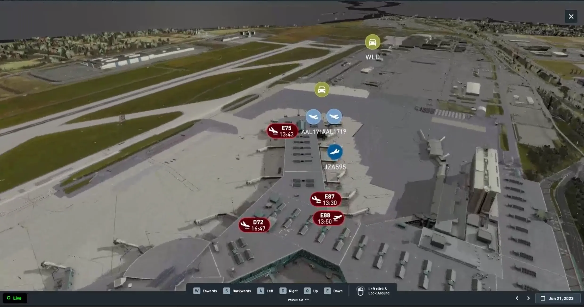
One shared source of truth for many teams — common dashboards and a task system tied to a real-time map. Aircraft and ground vehicles stream live from their transponders, so every item on the map reflects the airport moment to moment.
Internal UI is under NDA — shown here is the public system overview.
The Reality
Airports are complicated.
Deeply Layered Interdepartmental Politics
Complex stakeholder environment requiring careful alignment and negotiation.
Persistent Contention Over Data Ownership and Control
Ongoing challenges around data ownership, governance, and access across teams.
Limited Direct Access to End Users
User insights gathered indirectly through alternative methods.
The Product Owner Serves as the Primary Client Proxy
Collaborated primarily through the Product Owner, who acted as the principal client representative.
Feedback Gathered Under Inconsistent, Uncontrolled Test Conditions
User feedback collected in varying environments, requiring careful interpretation and synthesis.
My Role
Generic UX for every kind of user.
I was the UX designer on the project. My job was to create the interfaces and UX flows that surfaced this system for everyone — generic, wide-usage screens, layouts, and the design assets behind them, built to be picked up by any team across the airport.

Designing for Everyone
One interface every role can use.
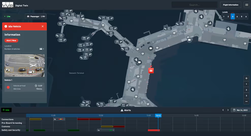
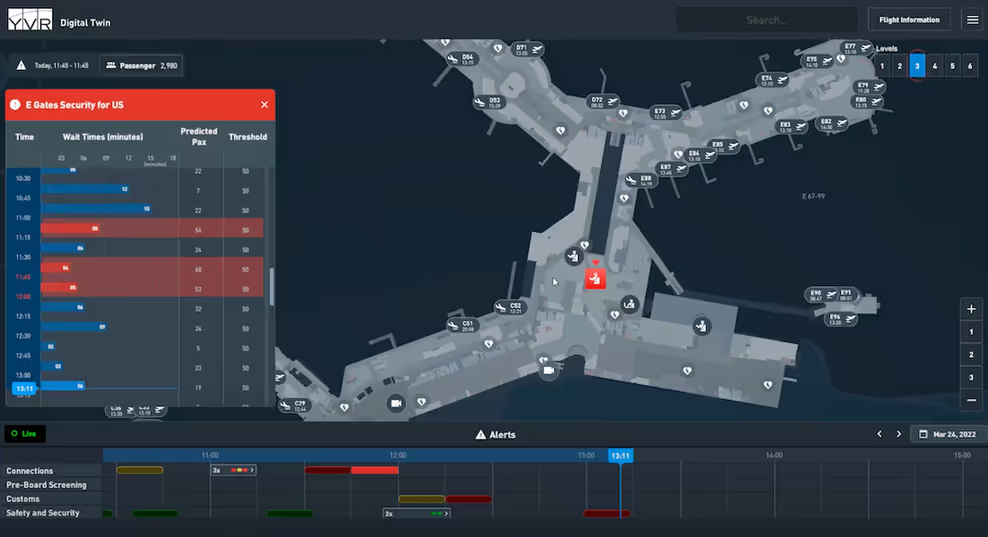
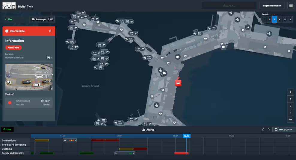
In the initial stages of the digital twin, it was theorized by the product owner that a single interface could service every department in the airport.
What I Built
Evolutions of the digital twin.
During my time at YVR, it became understood that one dashboard was insufficient for the different roles across the airport. My main task was expanding on the dashboards and making them more tailored to each specific role.
These screens are under NDA, so they are blurred for the public. Sign in to view them, then return to this page.
Design Handoff
How are new designs communicated?
As the sole UX designer providing designs for around ten developers, I had to find consistent, shared ways to communicate design intent — so everyone built from the same understanding.
Click-throughs ↗
Interactive prototypes developers can click through.
🔀Screen Flows ↗
End-to-end maps of each screen path and state.
📘Confluence Documents ↗
Written specs and design decisions in Confluence.
🎨Style Guide & Component References ↗
Shared tokens, components, and usage rules.
🎛️Tokens & Variables ↗
The full token & variable library powering the design system.
Iteration
How are designs iterated on?
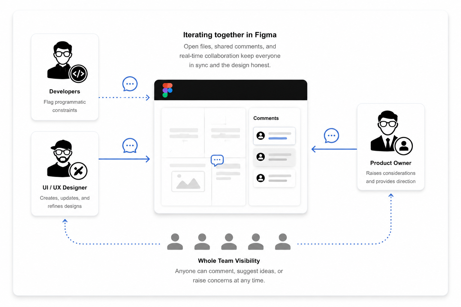
Because interdepartmental feedback was so hard to come by, iteration ran directly between me, the developers, and the product owner. We worked it out in Figma's comment system — files shared openly with the whole team, so anyone could weigh in whenever they needed: flagging a programmatic constraint, raising a consideration, or suggesting a better idea. It kept communication open and the design honest.
Takeaways
What did I learn from this experience?
Coming from video games, this was a huge departure for me — I had to refresh a whole set of skills and pick up plenty of new ones along the way.
C# Basics
Reading and writing C# to work alongside the dev team.
Unity Widgets
Designing UI built on Unity's widget / UI Toolkit system.
Traditional Interfaces Are Dead
Static, page-based UI gives way to live, data-driven surfaces.
Adaptable Ways of Working
Bending to new tools, teams, and processes on the fly.
Designing for Real-Time
Interfaces that update moment to moment, not on refresh.
Designing for GeoJSON
Laying out UI on top of live geospatial map data.
LIDAR & Satellite Data
Building around point-cloud and satellite imagery layers.
Transponder Data
Live aircraft & vehicle positions streamed onto the map.
Role
Sole UI/UX Designer
Client
Vancouver Airport (YVR)
Surface
Web · Real-time twin
Note
NDA — process only
Overview
The YVR digital twin provides a real-time reflection of airport operations for multiple teams via a shared source of truth driven by live data. Because access to end users was limited, design decisions were made through data interpretation, system constraints, and operational scenarios.
Due to the sensitivity of the work and NDAs signed during my time at YVR, I'm unable to share internal UI screens. What I can share is how I worked — the process, the thinking, and the decisions that shaped the product.
System overview: https://youtu.be/VZvKgQT1FkU?t=347
Operational Context
Airport operations are always in flux, filled with surprises and interdependencies. The digital twin is an experiment designed to assist staff in managing their diverse responsibilities. It provides cutting-edge technology that alerts them to various challenges, like early arrivals and mechanical issues, helping them navigate the complexities of airport life right from their hands.
The system was fed by:
•Real-time sensors and automated signals
•Staff manually logging operational events
•Complex legacy airport systems (e.g., NAVCAN and other operational sources)
Key constraints:
•Real-time data accuracy and latency
•Conflicting operational needs across teams
•Legacy platform limitations and integrations
•High cost of errors, delays, and missed alerts
Production Approach
Working out a production rhythm came with real challenges. YVR was a factional organization, so direct access to stakeholders wasn't common and priorities often leaned toward shipping functional outcomes over polishing usability. With fixed timelines and quotas, the most iteration we could realistically do happened internally.
In practice, the Product Owner acted as the client: they gathered and filtered input from across the airport, and we iterated primarily to meet the Product Owner's bar — because that was the fastest way to align teams and get work out the door.
Detailed Process
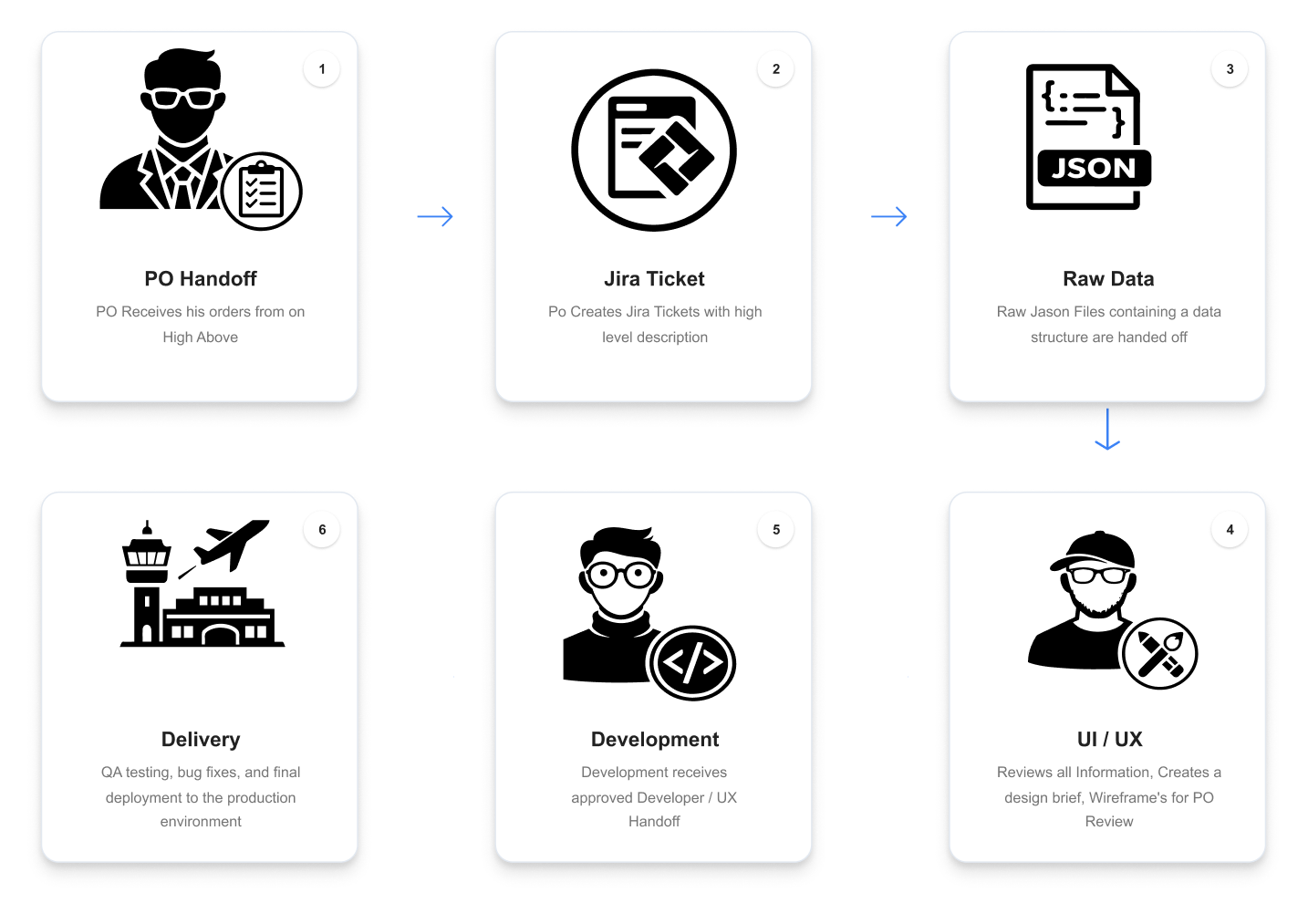
•Product Owner creates a Jira ticket with high-level requirements and attached JSON/data
•I expand the ticket into a design brief (goals, constraints, edge cases)
•Wireframes and concept designs, iterated with the Product Owner (iteration point #1)
•Build fully interactive Figma designs
•Developer handoff and implementation alignment (iteration point #2)
•Scope trimming or plan adjustments to hit delivery deadlines
Style Guide
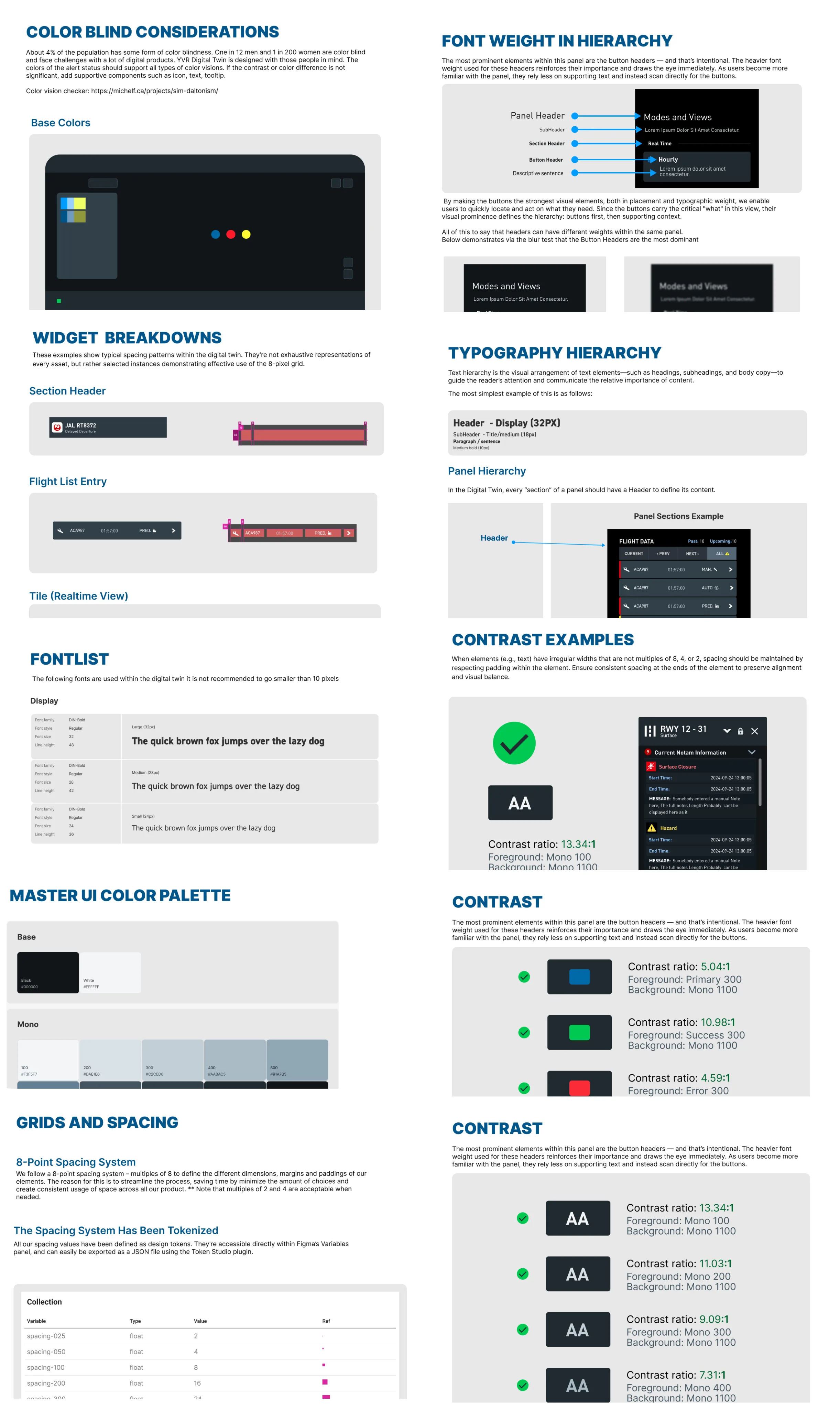
As the sole UI/UX designer, I owned and maintained a comprehensive Figma style guide — fonts, color system, tokens, components, and accessibility considerations (including contrast and color-blind support). It served as the single source of truth for the team and kept implementation consistent across 10+ developers. Some sections aren't shown here due to proprietary content; I can share the generic framework, but not the airport-specific designs.
Figma Variables to Scriptable Objects
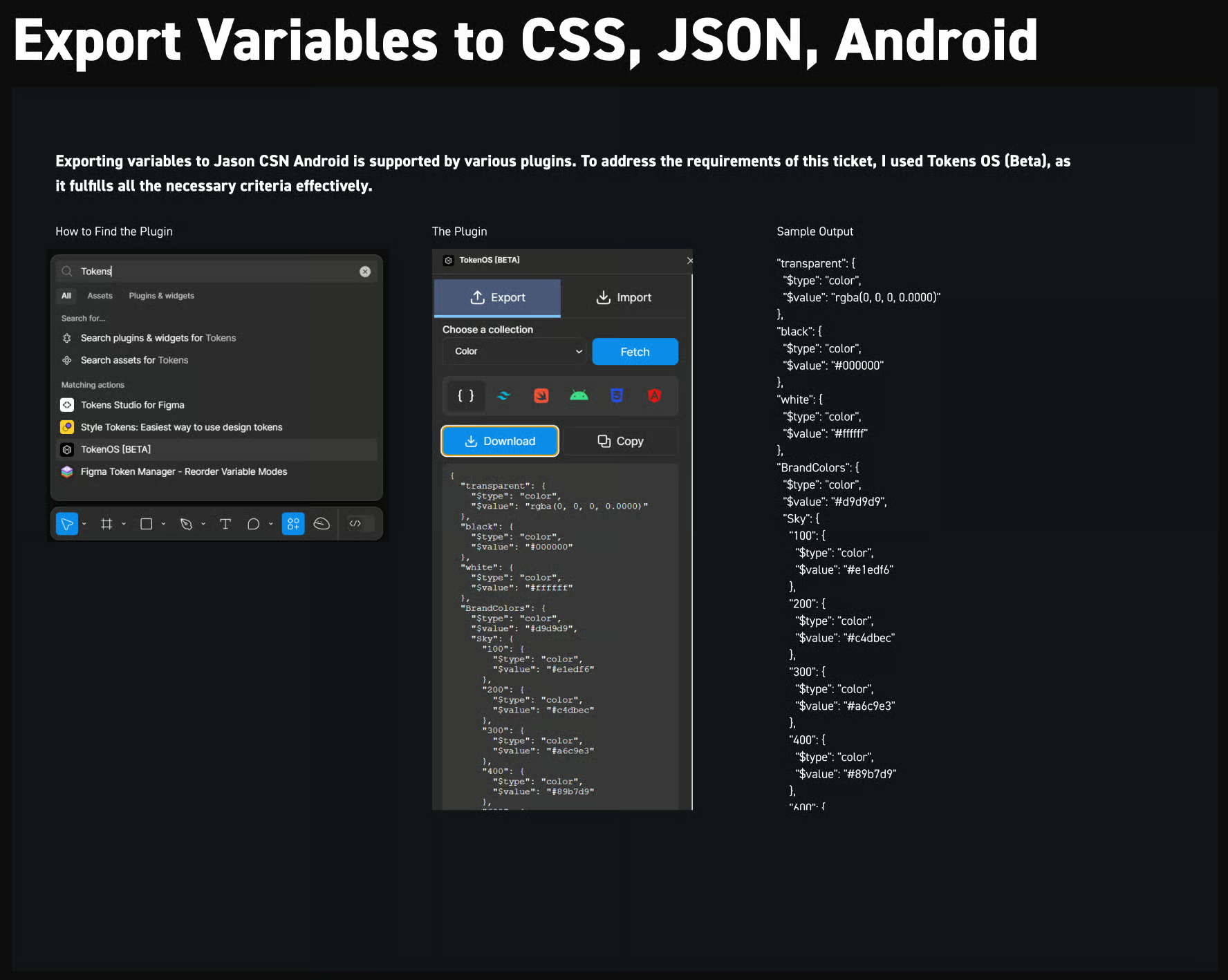
At YVR, one of my main goals was to streamline the Figma to Unity pipeline so layouts could transfer with minimal manual cleanup. I researched and prototyped an export approach where Figma variables/tokens are written to a JSON file, converted into Unity Scriptable Objects, and then applied through lightweight components so UI elements — colors, images, and styling rules — could be automatically themed and kept consistent across screens.
I believe this approach is entirely achievable, and I wish I'd had the time to take it to full production. With today's AI-assisted tooling, this kind of pipeline is more realistic than ever — if I could push it this far within project constraints, a well-supported team can absolutely finish it end-to-end.